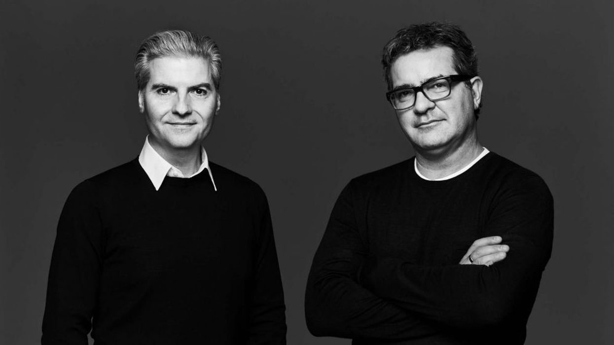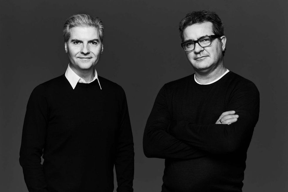
Diego Burdi and Paul Filek are the design duo behind Burdifilek, one of the leading interior design firms headquartered in Toronto.
The two first connected during their studies at the Ryerson School of Interior Design. But their decision to launch a studio came during the most unlikely time — the height of a recession in 1993.
Today, the studio of 35 employees has garnered over 150 notable industry awards along the way for its extensive portfolio.
Burdi and Filek’s experience runs the gamut of design projects, from retail/hospitality brands like Club Monaco, Hopson Grace, Stratus Winery, David’s Shoes, Capezio, to W Hotel — and beyond.
The success of their retail work opened the doors to real estate development projects when Context Development enlisted the duo to launch their Tip Top Tailor project.
Retail was about selling a lifestyle and an image. Selling loft living was not much different.
Since, Burdifilek has worked on numerous projects with visionaries like Great Gulf, Freed, and Canderel.
This year marks their 25th anniversary, so we thought it would be the perfect time to do a retrospective on some of our favourite Toronto spaces they’ve designed — including spaces for major Canadian brands.
Here’s what Burdi and Filek had to say about each of our top five spaces (in no particular order) that they’ve designed:
Stratus Winery
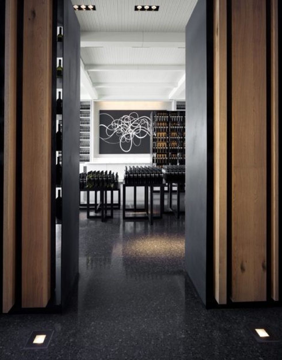
Stratus Winery was the first time we were asked to oversee the creative direction of a brand at launch.
This project was the culmination of many small design moves that challenged perceptions to break industry stereotypes. Taking charge of the design beyond the scope of interiors to consider every touchpoint (from the logo and labels to the bottle design). We saw an opportunity to move away from the traditional retail experience of how alcohol was typically presented and sold.
The client also wanted this to be the first LEED’s accredited winery. This was at a time when sustainability projects had a decidedly granola-aesthetic, before suppliers had product collections filled with “sustainable options” readily available for specifications.
We had a shared vision with our client to achieve a luxury project that did not sacrifice sustainability over style sensibility.
Our job as designers is really about problem-solving, so we experimented with raw, sustainable materials until we created a sophisticated palette to enhance the boutique sensibility of the winery.
It was fascinating to push our studio to create something that was so different from what the industry expected at the time. This project attracted an unprecedented amount of press around the world — with just one location.
To this day, it is still one of our most acclaimed projects. Seeing the impact of a timeless environment has definitely shaped the ethos of our studio.
Holt Renfrew
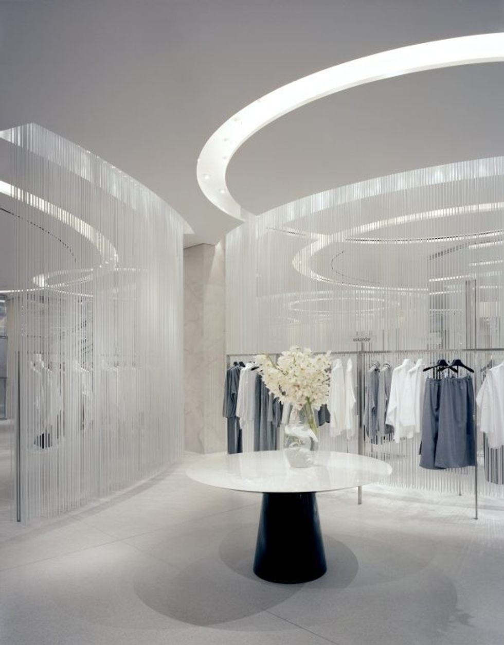
Designing the Holt Renfrew on Bloor Street was the catalyst for our large-scale projects.
Everyone involved with this project acknowledged the significance of the project. This was considered the flagship location for the brand, and all eyes were on this piece of real estate as the most covetted retail address in the country.
At the time, national department store competitors all followed the same format — designed from the retailer’s perspective resulted in stores that felt congested with product and difficult to navigate.
We saw an opportunity to create a more refined experience by focussing on the consumer experience instead, and both the client and the offering allowed us a lot of freedom to play with concepts of restraint and pause.
We designed an open-concept architectural envelope that became art in its own right. The restraint we exercised across this project created bold design statements that encouraged consumers to see the full product range, while also giving the product more perceived value.
The success of this project launched our department store portfolio, which has since brought us around the world to design for other world-class brands like Brown Thomas in Ireland, Neiman Marcus in the United States, and now in Korea with Hanwha Galleria, Lotte, Hyundai, and Shinsegae.
Mark Lash
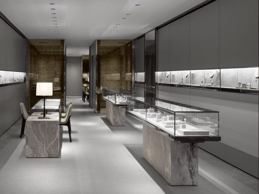
We are always impressed to see how far-reaching our local talent carries influence on the global stage.
Mark Lash designs jewellery for A-list celebrities around the world. His flagship store needed to reflect the timelessness of his creations, but also to elevate the beauty of its caché.
Fine jewellery carries a long history of pleasure and significance, and also has this strong association with craftsmanship and luxury. So we incorporated old world finishes while reinventing the proverbial jewelry store design with contemporary forms and functionality.
Now updated with a modern relevance, the store embodies a classic design identity with international appeal. We love creating these one-off projects that envelope you in an alternate universe, like walking into this jewellery box unlike any other.
Indigo
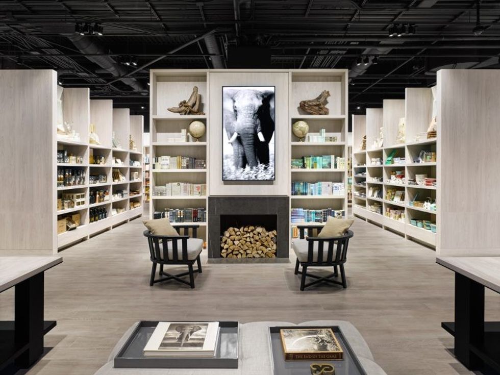
Tasked with reinventing a bookstore in the face of what felt like a global resistance against its core product (books) was such an interesting challenge.
For an industry armed with more questions than answers, we had to approach its design with fresh perspective. We cross-pollinated our expertise from designing luxury department stores to implementing a new innovative format for this specialty store.
Understanding the notion that books were just the beginning of a larger narrative to enrich our lives, the new design format keeps the books at the heart and soul of the experience, while compartmentalizing the store into several core categories.
Marrying books with product to create areas like Room Of Her Own, Joy of the Table, Paper Shop, Indigo Tech, Art and Photography, to name a few, Indigo is able to create a richer narrative for books in those categories.
By introducing new offerings in a digestible, enjoyable format, they created a platform to make the bookshop a place where the community can come together with special events, gather knowledge, and experience different product collections.
It’s been so well received, we are now working with the brand to expand beyond its national borders to reach a larger audience.
Mackage
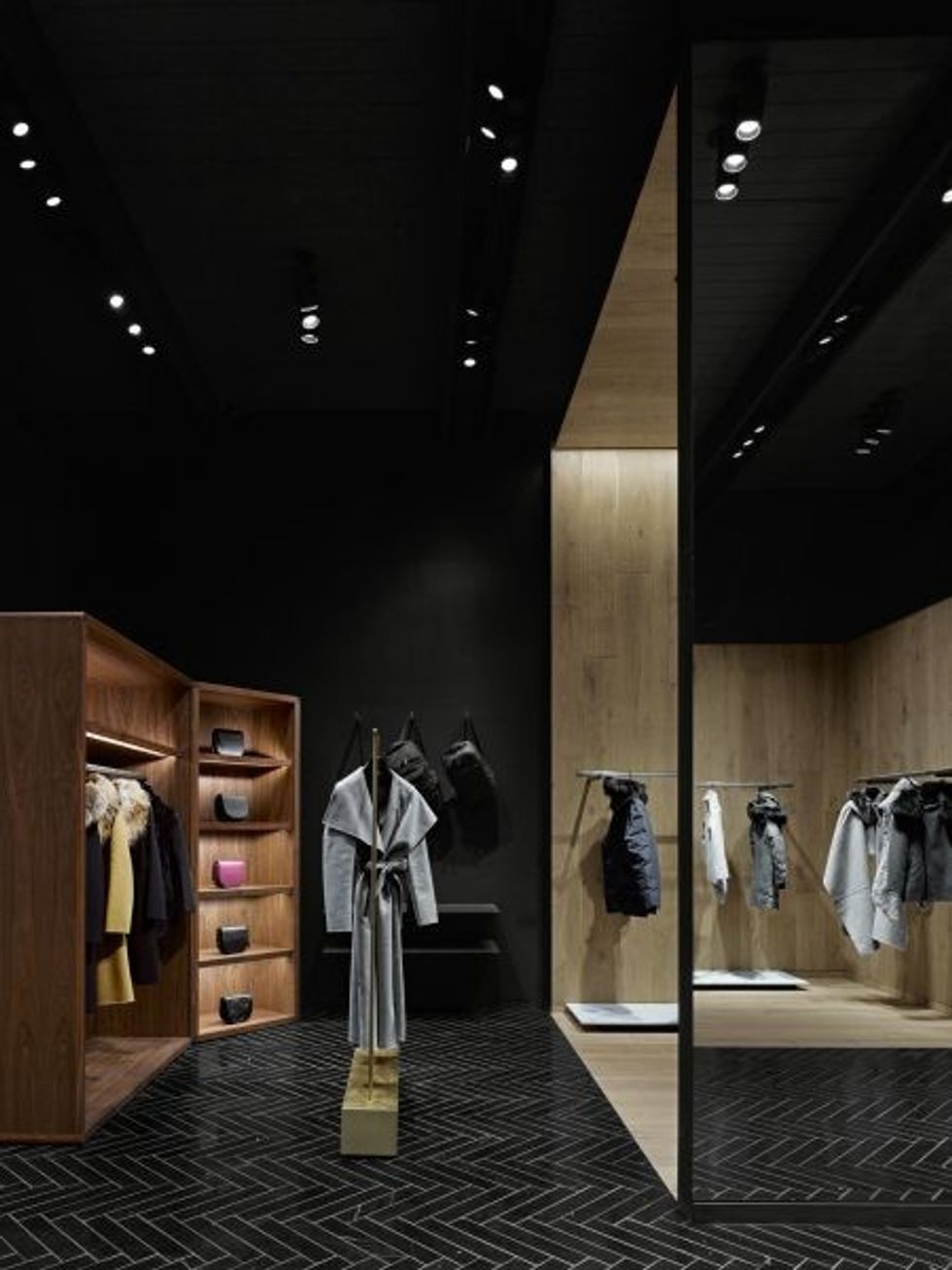
Mackage represents an exciting new generation of Canadian talent that is attracting a strong global audience.
Since a digital-only experience can be very one-dimensional, we came on board to design and launch their own stores. We had the freedom of a blank canvas to design an homage to its Canadian heritage while reflecting their fashion-forward sensibility, so we transcended the stereotypical “Canadiana” design references.
The design drew inspiration as an urban ski chalet, where subtle sculptural references to snow, ice, and cold are expressed in warm tones and noble materials to resemble a warm cocoon from the elements.
From the back-lit image looking out across the Rocky Mountains to the cash desk resembling a chiselled chunk of an iceberg, the environment brings forward the connotations of nature, winter, and the vernacular landscape in an understated manner.
Twenty-five years of projects later, there’s no doubt the emotional brand connection strengthens when a brand can be experienced authentically.
Consumers appreciate the thoughtfulness of a beautifully appointed, well-considered experience.
