We all know red is the colour of love, but from the palest pink to the deepest maroon, “red” can be just about anything.
When you’re decorating your bedroom, it pays to be aware of the impression your chosen red can make. In honour of Valentine’s Day, we’ve come up with 50 Shades of Red you can use to help ignite the passion in your boudoir, whether that passion is for the love of your life, or for the soul-satisfying creation of a perfect space to call your own.
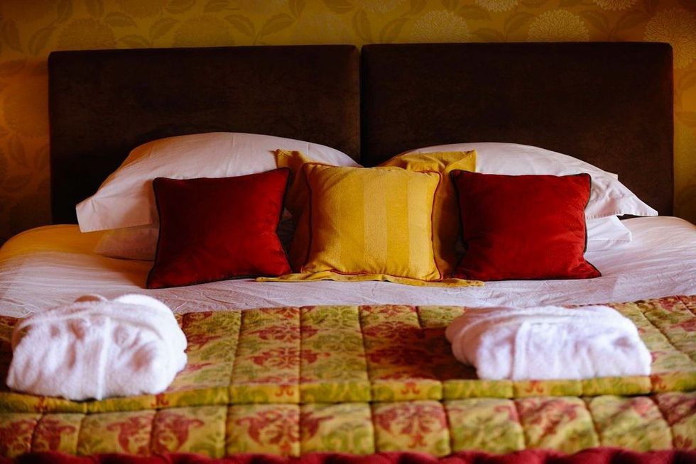
Bright reds
What they call them at the paint store: poppy, scarlet, ruby, crimson, fire engine, cardinal, chilli, vermillion, cherry, candy apple
These shades don’t wander far from primary red, and few colours make a bigger impact. Blatantly high-energy and sexy, bright reds can fit into virtually any decor.
Be careful around whites and blues, unless you’re going for “nautical” or “American patriot.” Too much can come off as aggressive — not that there’s anything wrong with that in the bedroom, but be aware of its power so you don’t overdo it.
If bright red walls seem a bit much, consider painting the walls inside your closet or ensuite bath, and then carry the colour into the room with accents. Bright red works particularly well with an Asian theme so try looking east for inspiration, and embrace cloisonné bowls, an enamelled side table or a whimsical parasol hanging from a corner of the ceiling.
In addition to indicating passion, red has been said to stimulate appetites, so don’t forget the whipped cream.
Dark reds
What they call them at the paint store: oxblood, burgundy, Bordeaux, maroon, currant, sangria, mahogany, brick, garnet, merlot
There’s a reason so many of the shades in this family are named for wines; they have the same delicious, look-how-grown-up-I-am taste, and they may leave you a little drunk — with power. Dark reds are subconsciously associated with vigour and leadership, so if you've decided to include a good helping in the bedroom, be prepared for a power struggle of the most interesting kind.
Dark reds are sophisticated and elegant, and hard to incorporate if you're big on whimsy. Navy blue, dark green and tan make great companion colours; if yellow is your thing, stick to an antique gold when there's a dark red nearby. In general, a dark red benefits most from subdued companion colours, as opposed to bright, saturated tones.
If you’re going for something eye-catching and yet simple and elegant, you can’t go wrong with white wainscoting and ceiling alongside deep red walls. Who'd have ever thought "oxblood" could be sexy?
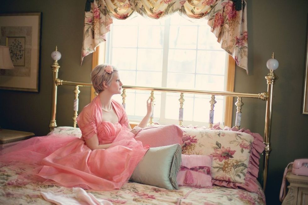
Pinks
What they call them at the paint store: flamingo, fuschia, blush, bubble gum, coral, salmon, magenta, fruit punch, raspberry, cerise
We call it light blue, light yellow and light green, so why does light red get a name of its own? Perhaps because the power of red is simply undeniable, even when we add a dollop — or a heap — of white.
Pink is the youthful side of the red family, conveying a more tender, sensitive side of love more than a lusty side. Psychologically speaking, pink has been used to calm prisoners in a Swiss jail and in attempts to turn the opposing team into weakened pansies in a pink visitors’ locker room at a stadium in Iowa. While a weakened opponent may not be your goal this Valentine’s Day, a little pink can help create a cheerful or calming environment. Overdone, it can be off-puttingly juvenile.
Use a bright pink on the walls of a smallish reading nook, or choose a shade with some purple in it to add a touch of seduction. Incidentally, a deep pink with rose undertones used in a dining room is a great way to help your guests look their best — throw in some candlelight and it’s an instant facelift.
If you just can’t resist a Bubblicious shade, make it more sophisticated by pairing it with a metallic.
Orange reds
What they call them at the paint store: ginger, roasted squash, marmalade, marigold, sunrise/sunset, salamander, papaya, terracotta, paprika, burnt sienna
Full-on orange can be a bit too much, but bump up the red and you’ve got a sensual, nature-based addition to your palette that can warm up any space.
Because it’s so saturated, consider adding orangey-red in nuanced, nearly subversive ways, like painting the back of a bookcase so it just peeks through the tchotchkes or on the mats of metal-framed, black and white photographs. A deep shade of orange has so much personality, it can become an art piece practically by itself — stretch a yellow-to-deep red (with orange in the middle, of course) ombré piece of fabric over a canvas frame and you’ve got an instant sunset worthy of an over-the-sofa place of honour. These shades work wonderfully well with warm, dark wood finishes, especially when you lighten them up with lots of white.
Orange’s complementary colour is blue, and the pair work best together when they’re the same tone: match a lighter orange shade with a lighter blue, darks with dark. Wherever you sneak it in, orange-reds are irrepressible.
Famous reds
What they call them at the paint store: They probably call it something fun and whimsical, but it could be anything, depending on the brand. Woowoo Red, Indie Orange, Enticing Pink. Just snap a screenshot of your favourite famous red and take it with you to be colour-sampled.
The colours of your decor palette are about mood. You want to feel a certain way when you enter each room of your home, and in particular, the bedroom. Think about your favourite movie or TV show and how it makes you feel. There’s a reason you love it, and subconsciously, the film’s palette is a part of that.
Here are 10 Hollywood examples of reds used to create an atmosphere, followed by the mood they may inspire.
- Johnny Depp-as-the-Mad Hatter’s orange hair, peach hat and rosy eye shadow in Through the Looking Glass: a little (a lot) wacky, but free of the tethers of convention.
- The perfect red petals strewn all over Mena Suvari in the American Beauty poster: sex with a side of the illicit.
- The inside of the canoe in Life of Pi (as well as its many other elements of red used in the film): reverence.
- Uma Thurman’s lips in Pulp Fiction: reckless abandon.
- Just about any superhero, including the inside of Thor’s cape in The Avengers: invincibility (you may want to stay away from Deadpool red — that guy was messed up).
- The reds and oranges set of the Central Perk coffee shop on Friends: camaraderie (check out the couch and the rug under it especially, as well as a tapestry bench in the background, stage left).
- Julia Roberts’ red gown in Pretty Woman: traditional (as in, riding off into the sunset) romance.
- The office walls in Secretary (remember the “pull down your pantyhose” scene?): sigh.
- Just about any scene in True Blood features some red for obvious reasons, but look especially at the interior of the bar Fangtasia: sexy with a side of submission/fear (hey, we don’t judge!).
- In Ryan Gosling’s Crazy Stupid Love house, a mostly-white palette is broken up with other neutrals and one key detail — one big red painting on the wall: in a world of sameness, always leave room for something really special.
Hollywood directors and marketers have much bigger budgets than we do. Take advantage of their expertise — they knew exactly what mood they were going for when they chose their costumes and set decor. If their work sparks a certain mood in you, imagine what it could do in your home.