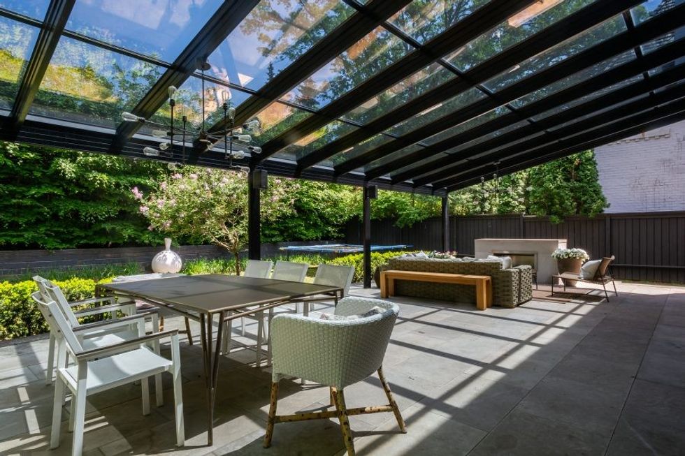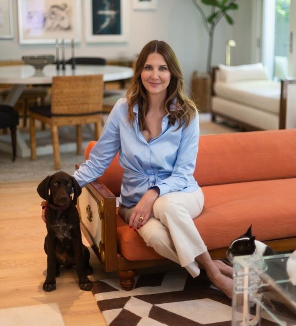
Sitting in the backyard of her light-filled Forest Hill Georgian-style home, Dr. Sandy Skotnicki is juggling a chocolatey German shorthair puppy, Odin, whose big paws indicate he will dwarf Stella, the Boston terrier also snuffling around her feet.
Juggling is something Skotnicki does well.
In addition to her clinical practice, Bay Street Dermatology, of which she is founder and medical director, she is an assistant professor at University of Toronto’s medical school.
There are now six kids racing in and out of this space.
And then there is her Amazon bestseller, Beyond Soap, released last month that has swallowed her in a whirl of TV, radio, magazine and morning show interviews.
“The response has been mind-blowing,” says Skotnicki, an expert on skin allergies.
“I hit a nerve,” she says, of the book, whose central message is that we are washing our skin too much, and using too many products too often.
This is, of course, against the interests of most of her colleagues, peddling lines, and the beauty and wellness industrial complex that has been dedicated to having us emptying the endless aisles of gear meant to make us cleaner, healthier and glowing, that very modern buzzword and Instaworthy #skingoal.
Dermatologists usually become celebrities for their fashionable and famous clientele, who flock for Botox and other-evergreen injectibles.
And yes, Toronto-based Dr. Sandy Skotnicki does have a circle of beautiful clients and friends, the cream of society, business and fashion worlds.
But the woman herself is serious about her medical career first.
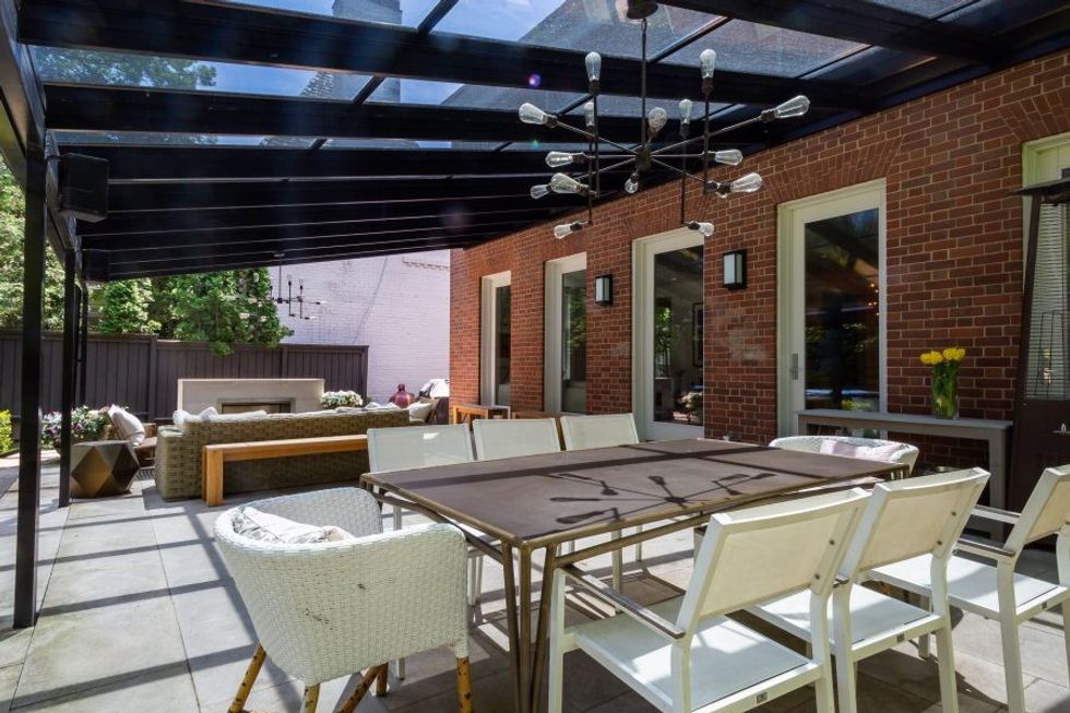
She sits in her backyard, on sprawling Renovation Hardware outdoor sofas plumped with faux fur throws, without a lick of makeup. Her skin is indeed glowy, which she puts down to good genetics.
“It’s my mother’s skin,” she demurs.
And she takes diligent care of it, primarily with sunscreen.
But also, fun dermatologist note: the custom glass roof over the seating and eating areas of the patio, basically a greenhouse without the walls, is made of tinted glass that blocks almost all harmful rays from the sun.
Skotnicki found this place in 2009, on the heels of a divorce.
“It was a renovation down to the studs,” she says.
“It was a wreck, everyone told me not to buy it. But I brought in Christine and Michelle [designers Christin Ralphs and Michelle Lloyd of Lloyd Ralphs Design] and they saw the potential that I did.
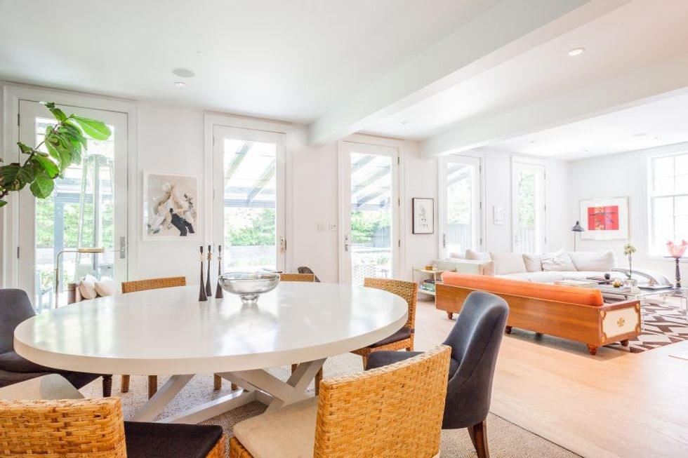
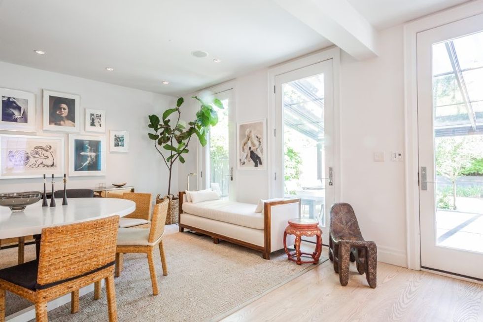
"The idea was a beach house, all white and open inside and out to the backyard, filled with art and some glam Hollywood Regency vintage pieces. It is a big square house and I love the solidity and reassurance of that.”
Skotnicki says she approached the reno and design the way she does everything: one step at a time, as she could afford it. She collects art the same way.
“When I finally finished medical school, I started looking for pieces. I couldn’t afford much, but was drawn to photography. Then when I met Jane Corkin, that interest took shape in fashion photography, which is not something I would have expected. But I buy what I respond to.”
She shares a pro collector’s tip: when she finds an artist she likes, but can’t afford a big painting, she will look to works on paper as an affordable alternative.
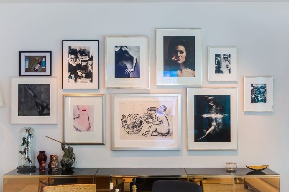
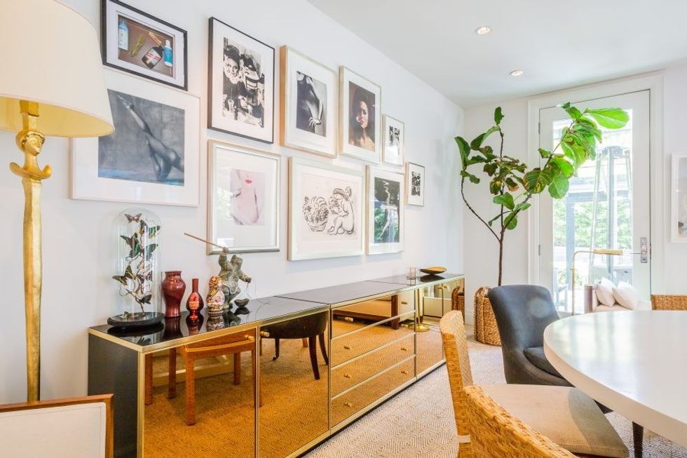
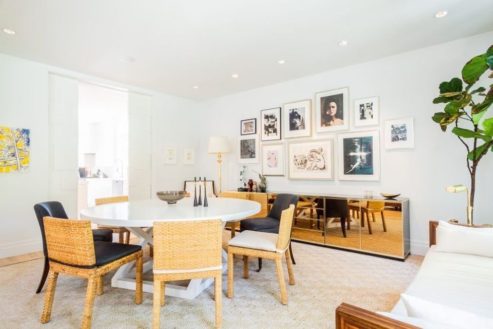
The best example of this is Skotnicki’s “wall of women,” as she dubbed the arrangement on her dining room hall.
The big, round table is a gathering point, and Lloyd and Ralphs kept the furniture profile low-slung to maximize a sense of open space. Wicker chairs contribute to the beachy vibe.
But it is the pictures of women, by artists such as Lillian Bassman, Francesco Scavullo, Nigel Scott and Erwin Blumenfeld, arranged above a glass and brass console that anchor the room.
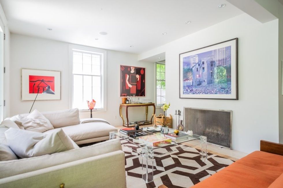
In the living room, there is another unusual vintage sofa with wooden detailing found by the design team in Palm Beach. But the artworks are again the stars, with pieces by Robert Motherwell (a work on paper, as above), Greg Girard, Barbara Astman and an Inuit artist from Iqaluit.
A graphic black-and-white rug in the living room echoes patterns that run through the house, from the staircase rail to the striking custom stair runner that looks like zebra teeth.
“I saw Kelly Wearstler’s own staircase in a picture and I asked the girls to basically copy it,” says Skotnicki, of the LA designer who is most associated with that Hollywood Regency look she admires.
The high-design bones are fleshed out with pieces Skotnicki brings back from her travels.
She loves to travel with family, but knows also that balance in a life as busy as hers is necessary. So, she makes time for big adventures with her gang of girlfriends, including a trip to the Arctic a few years ago, and most recently a big birthday trip to Peru.
“We weren’t touring, we were seriously climbing,” she says. “We trained together early mornings on the steps at Casa Loma on Davenport before Machu Pichu.”
A careful eye will find evidence of her adventures, from the Peruvian bench to a framed knit hat. But the antique wooden sculpture set on a pedestal under the stairs is the best example about how a designed space can be shared with kids.
Skotnicki’s boys often turn the head around. She turns it back forwards. The game continues apace.
Indeed, the house design has elegantly grown with her life.
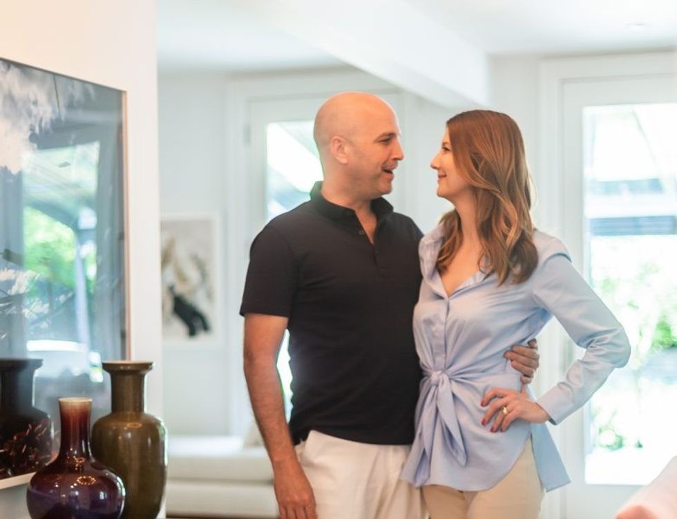
Now that Skotnicki’s life partner, Alex Kotyck, founder of management consulting company BridgeRock, has moved in, her boys (aged 13 to 19) are often joined by his three kids (two boys and a girl, aged 11 to 16).
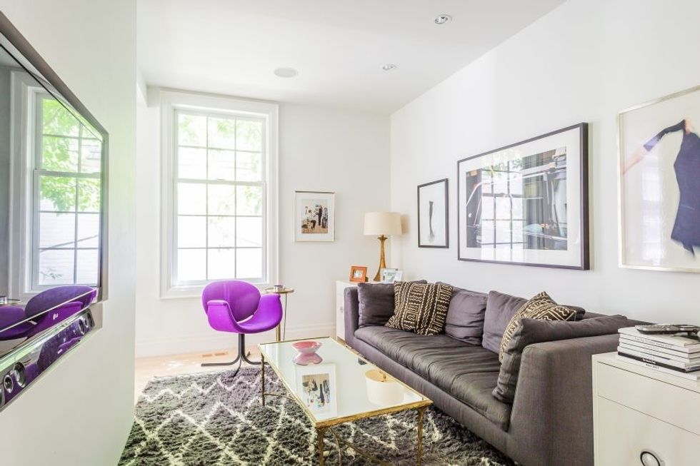
The little room tucked behind the fireplace, originally conceived as an art video-watching room, is now a TV room, an easy concession to the number of kids versus adults.
The purple vintage chair, a favourite of Skotnicki’s, remains a pop of colour in the entertainment alcove.
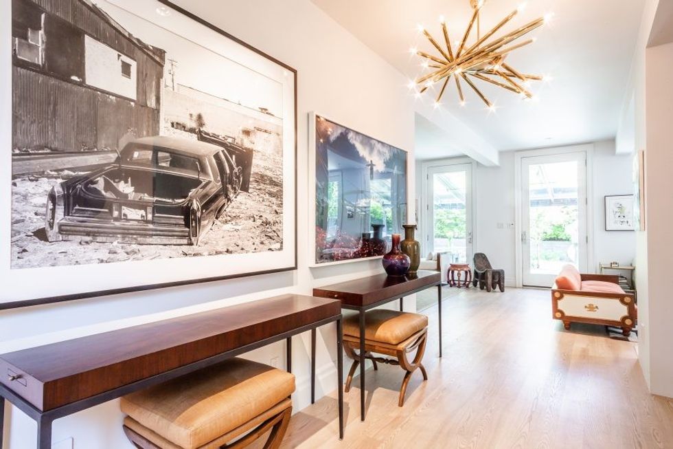
The two 19th-century vases in the hall, one a Teadust vase the other a Sang de Boeuf vase, would give someone of lesser composure (myself, for instance) pause in a houseful of rambunctious kids, a Bart Simpson moment waiting to happen.
But then they do look so darned good as visual punctuation for the perfectly symmetrical console tables and chairs, and the arresting art: Roy Arden’s black and white d’Elegance (2000) and Lianjie Zheng, Binding the Lost Souls: Black Cola, Great Wall, China (1993).
As with most families, the kitchen is centre of family life.
And this one is remarkable — when you find out that it is IKEA cabinetry.
The island has no working features, but it does have expensive stools, a classic high-low play. The room is designed to maximize the oversized Palladian windows, and the dramatic light fixtures.
“We decided to make overhead light fixtures, some found and some custom, a big focus throughout the main floor,” Skotnicki says, to spend the money on the decor-equivalent of jewellery.
This good-bones design philosophy dovetails neatly with Dr. Skotnicki’s professional approach.
Her book has done so well (enthralling Oprah’s beauty editor, and earning the front page of the Globe’s Opinion section), because her ideas are both intuitive, and science-backed.
Done up after a hair-makeup session for our photo shoot, she is more glam than bare-faced on the couch earlier.
But she sounds like the same, impassioned clinician, citing the creation of Ivory soap in the 1880s as an inciting moment, when marketers embedded the idea that we in the Western world need to lather ourselves up daily (or more) to be “good and healthy and presentable, socially.”
Nonsense, she says, going on to cite Malcolm Gladwell (via Howard Moskowitz) on the debut of horizontal marketing in the ‘70s, wherein manufacturers (from spaghetti sauce to shampoo), worked out the fact we like to choose from a broad array of options.
That is why we now have too much choice in the skin, body and hair care aisles, and why we also have an “epidemic” of eczema and sensitive skin.
If Skotnicki has her way, we will all do her product elimination detox to determine what rubs our own skin the wrong way, and we will learn to read the labels.
“Your skin is your largest organ, and it is a wondrous protective barrier. But we are stripping the lipids and natural bacteria.
“It is like removing the mortar that binds the bricks, the whole wall will crumble.”
A fine analogy indeed to wrap up a piece on Dr. Sandy Skotnicki’s happy, busy and full home.
