During the first week of October, Sassafraz — the once go-to restaurant for A-list celebs and a certain societal set — hosted a party to not only celebrate their 20th anniversary but to showcase their all-new menu and, most notably, their two-years in the making re-design.
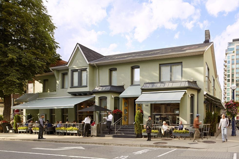
This once-yellow and talk-of-the-town restaurant at the corner of Bellair and Cumberland, partnered with DesignAgency to help give the space a facelift.
At first, the most notable change is the now green sage exterior with a yellow door that pays homage to the history of the space.
READ: This New Toronto Art Gallery May Be Contemporary But It’s A Piece Of The City’s History
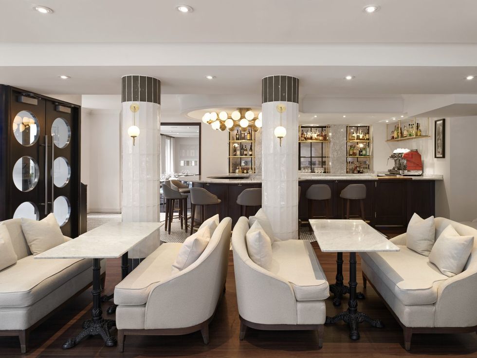
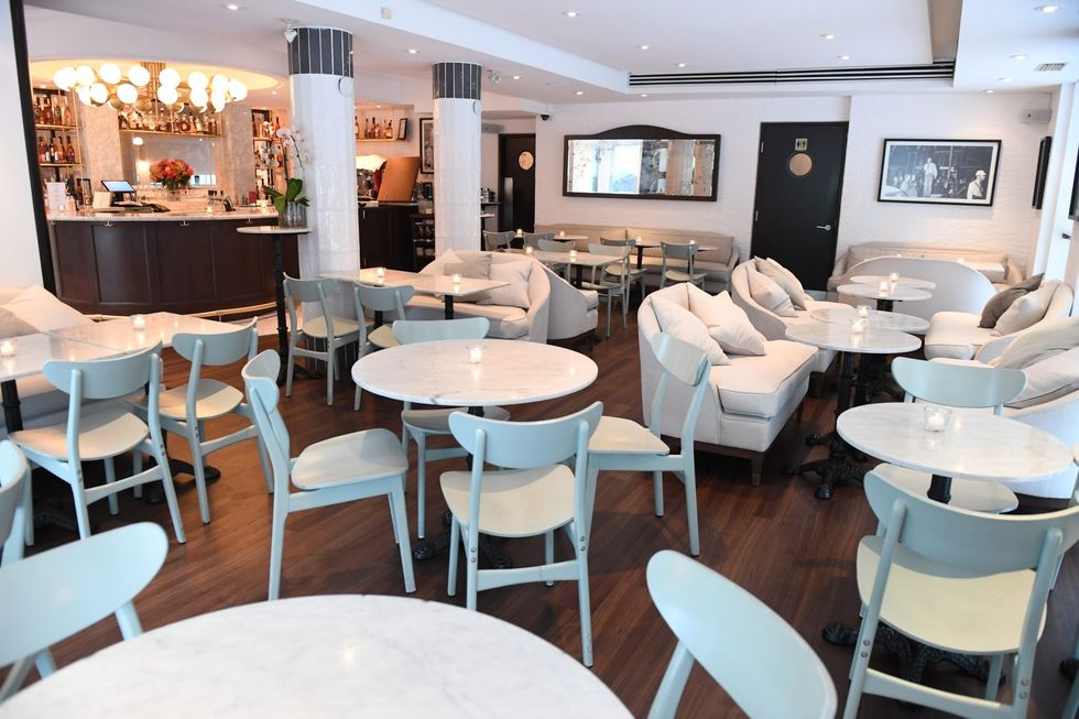
Once inside, you still have a cozy spot in the S-café for cocktails and bites, but the space has opened, connecting the café bar area to the main dining room seamlessly.
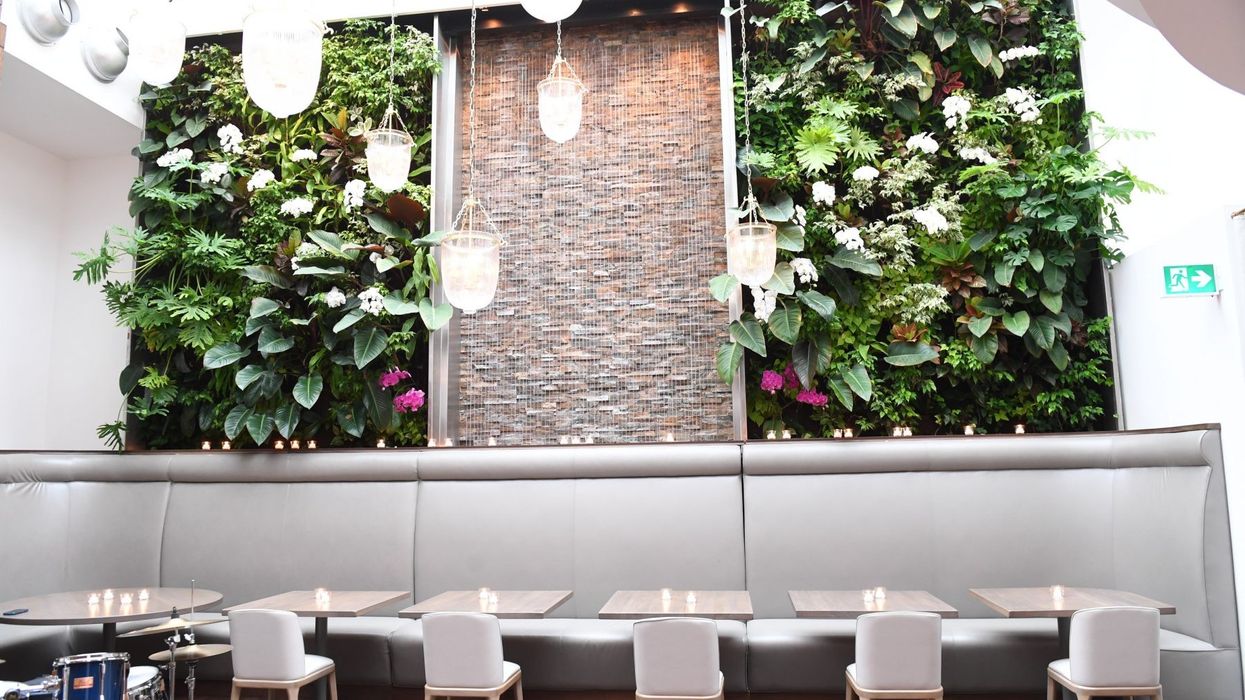
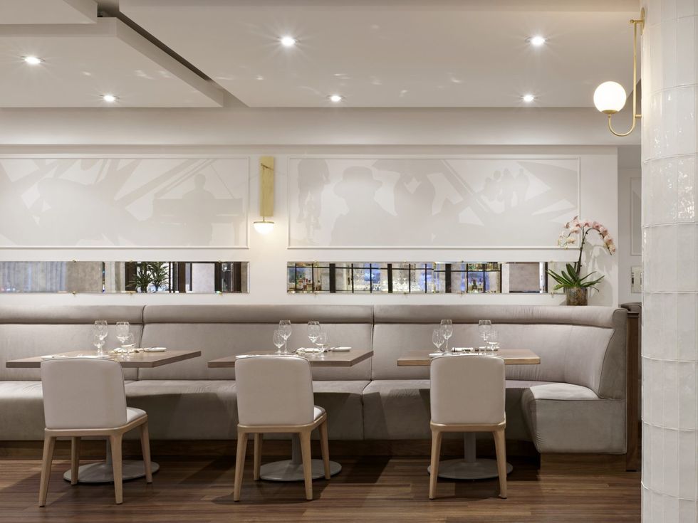
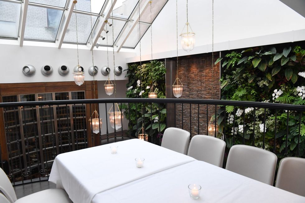
Through the use of thin, horizontal mirrors across the dining room, a living green wall with orchids (perfect for that Insta post,) new custom-made banquettes, chandeliers and flooring, no detail was left unturned, creating the ultimate nip and tuck.
I spoke to senior designer Julia Summerville from DesignAgency on the vision of the redesign, what changes were made to the space, how they tackled major design decisions and what you can expect from the refreshed 10,000-square-foot space.
When you were brought on to give this spot a facelift, and did you have any direction? Or was it up to you and your team to use your expertise to decide how to rebrand and redesign the space?
The intent was to create a timeless, elegant and inviting interior, which spoke to its loyal patrons but was also attractive to new clientele and could be a great gathering space for private events and weddings.
READ: TV Host Jackie Redmond Talks Life In Toronto Vs. NYC And Shows You Her New Home
The goal was to achieve a subtle design with a soft and tonal colour palette that had a slight New York edge.
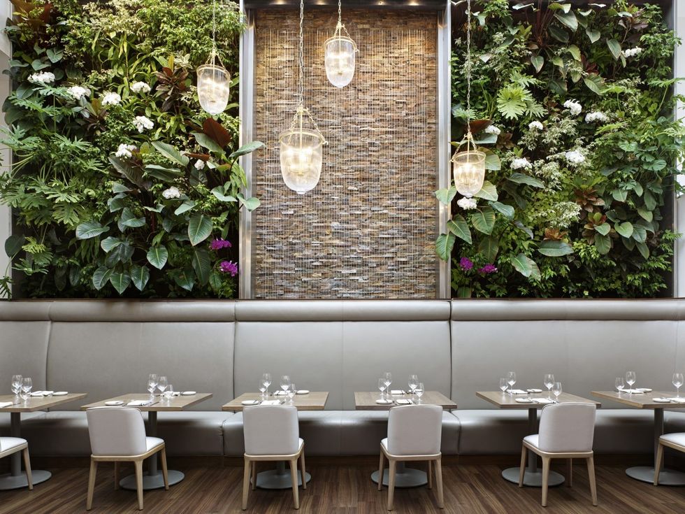
What was your ultimate plan when renewing this space and taking on this project?
DesignAgency’s goal was to envision a space that was layered, warm, and an approachable place for day to night gatherings.
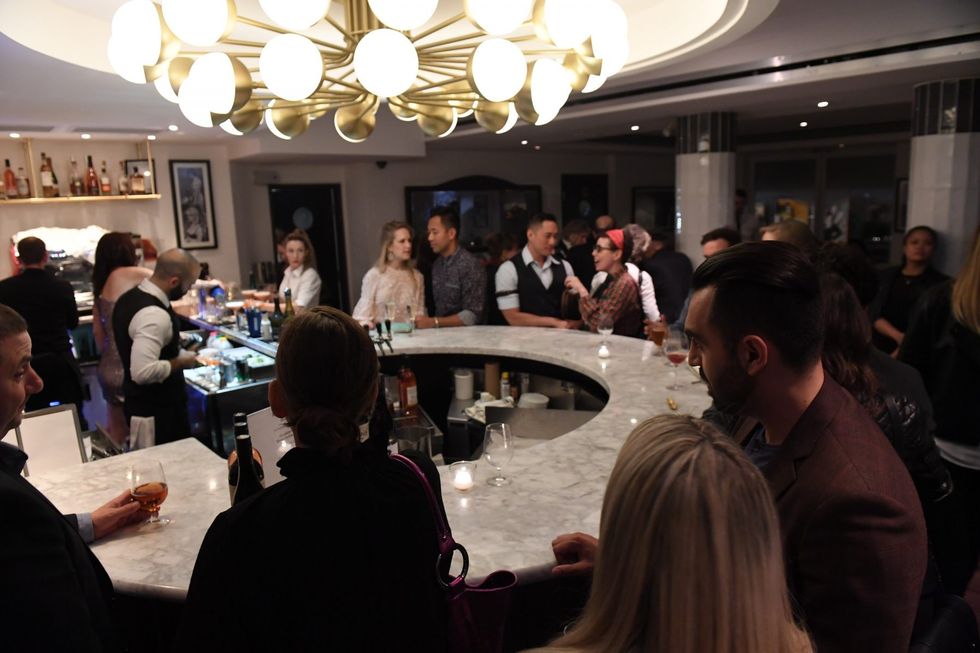
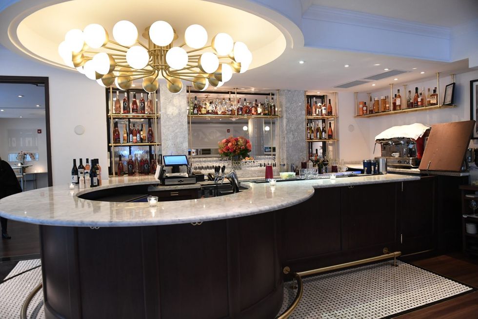
We created a round bar to re-introduce a conversation to the café: this instilled a great hub of activity and provided a strong anchor to the room.
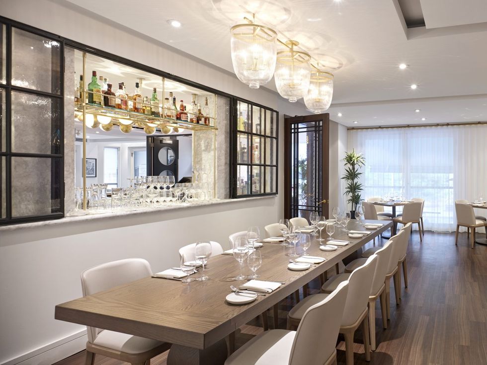
A beautifully arrayed custom light fixture anchors the bar and we inserted a window into the back bar, creating a connection to the dining room space that further enhanced the ambiance of the overall restaurant.
We also believed that this project required a custom approach to the upholstery and lighting designs.
We were intent on highlighting the back green wall and skylight in a dynamic way and designed custom lanterns that transformed into sparkling jewels at night, enhancing the architecture of the room. Artisan materials were utilized with the irregular glazed tiles that surround the columns and wall lights provided that extra layer of reflection to the space.
READ: Top Toronto Places For Singles: Where To Meet Your Next Boyfriend Or Girlfriend
Specialty seeded glass was introduced into the custom designed glazing for the back bar window, and double doors into the dining room space provided an ambiance to the restaurant.
The final layer was achieving a level of softness to the space with warm velvets for the upholstery, pulled linen curtains and soft curves to the custom upholstery which envelop the guests.
What are the most notable nips and tucks, if you will, that you’ve done to rejuvenate this spot?
The space works well for all groups, which was part of the design planning for the restaurant. We wanted to ensure that a table of six could be nestled in at the centre of the dining room space, and still feel comfortable with a romantic table of two next door.
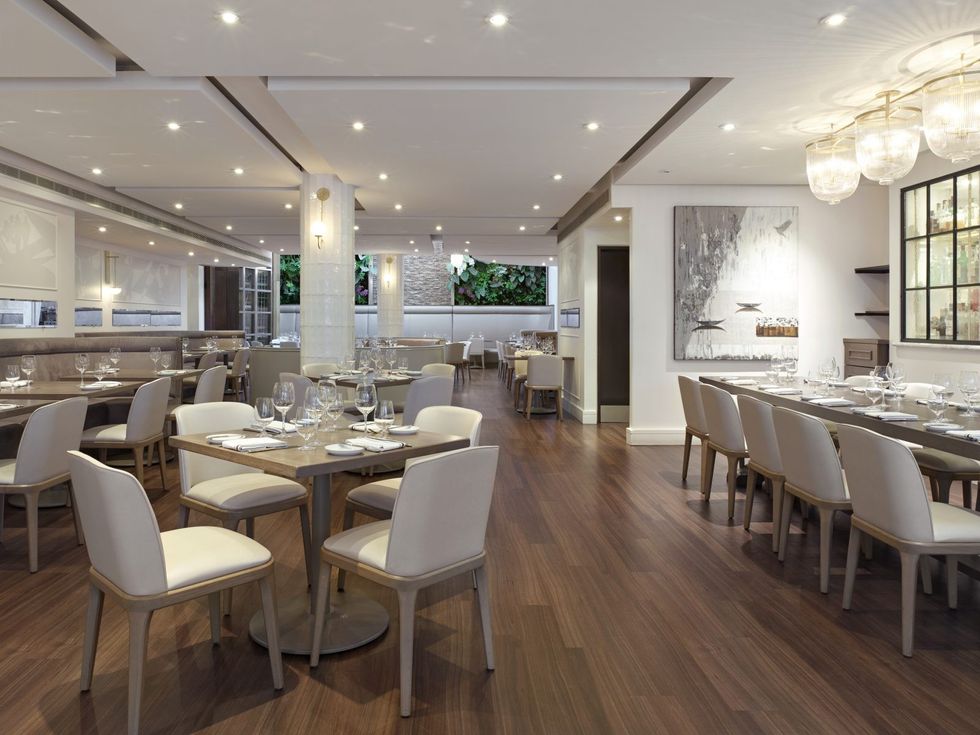
We created zones in both the café and dining room to ensure customers could find their ‘special spot’ and make it their own.
We created long banquettes to ensure flexibility and also designed sofas in the café, which were a Sassafraz signature, but made them more plush and tailored to uplift the space.
We specified a dark flooring, which grounds the room, and inlaid a classic basket weave marble floor inserting immediate elegance to the space, but also allowed the restaurant to maintain its approachable atmosphere.
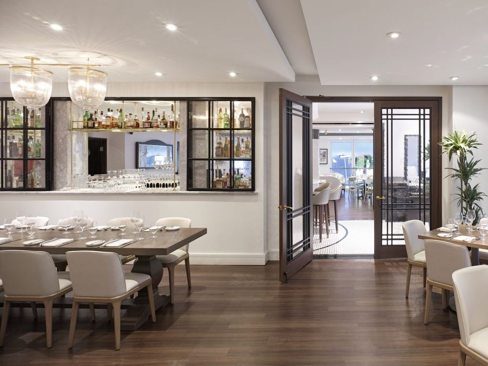
You opened the wall between the café and the restaurant proper. What was your intention with that and what else did you do to achieve that openness in the space?
This was a big design move for us, as we wanted to create a connection between the two rooms but also allow for privacy without taking away from the beautiful light that filters through the restaurant.
This was a custom designed piece and we worked with local suppliers to ensure the details were just right.
We designed this window in the spirit of European proportions, and delicate details with the hinges that gave a historic elegance but still felt classic and modern.
READ: Toronto’s Newest Boutique Hotel Is A Blast From The Past: The Anndore House
We selected a beautiful artistic glass which provided an infinite reflection of light and brought in that extra spirit of character into the room.
A new set of double doors were also introduced and were applied with the same treatment. This really helped in achieving a connection to both spaces.
Your team installed curtains at the front of the venue to create a more exclusive and private feel when people are in the dining room, whether it be for private events or for dinner. This is different than the 20 years before, where passersby could peek in and see what was going on. Why was this addition important to you guys?
Private functions are so important in any sought-after space, so the layering of softness along the front wall adjacent to Cumberland Street was very important for us in maintaining a level of privacy but also distilling the light in the daytime as well.
Our biggest challenge was ensuring the colour was just right, and the hardware felt delicate and almost residential in nature. We are very pleased with the outcome.
Tell me about the jewelled pillars with the off-white glare throughout the dining room.
These specialty artisan tiles are irregular in form and provide a hand-made feel to the room as they catch the light in just the right way.
We were over the moon with the design outcome for the columns, as they were part of the architectural language of the space, and we built out the existing columns as oversized circles to give structure to both spaces.
READ: Top 7 Toronto Places To Meet Your Dating App Match IRL
The modern tile application turned out beautifully, as the edges of the tile catch the light in a perfect way, especially with the assistance of the warm glow from the sconces. This element becomes another jewel in the space and a great conversation piece.
Why was it necessary to bid the signature yellow adieu and make way for a more white, grey and sage green space?
This was a big decision for us; when we sat down with the clients and talked about what inspired both of us, it was evident that a nod to New York bistros and European details but always staying timeless in design approach was the ultimate goal.
Each creative decision was carefully considered; creating a soft, subdued interior was the natural approach to ensure the heritage of Sassafraz was not lost, and the spirit of the building and interior was maintained but uplifted in a modern way.
We paid homage to the Signature yellow by introducing a playful accent of the yellow on the Front Door.
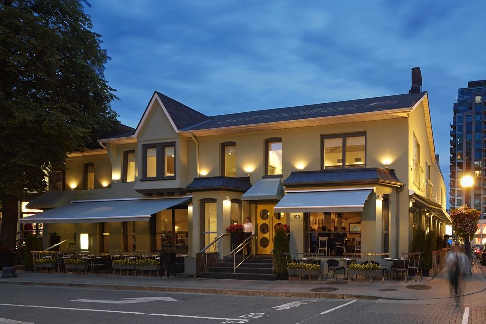
Overall, the building feels more grounded on the street and the warm glow that exudes from the interiors maintains this iconic restaurant as an important establishment for the Bloor-Yorkville community.
The 10,000 square feet on two levels has a total of 150 seats inside (100 in the dining room, and 50 in the S-café) with another 50 on the outdoor patio. The private event space has enough room to seat 80, with 200 standing. The lead designer for the renovation is Matt Davis from DesignAgency.
For more information or reservations, visit: https://www.sassafraz.ca/restaurant.aspx
