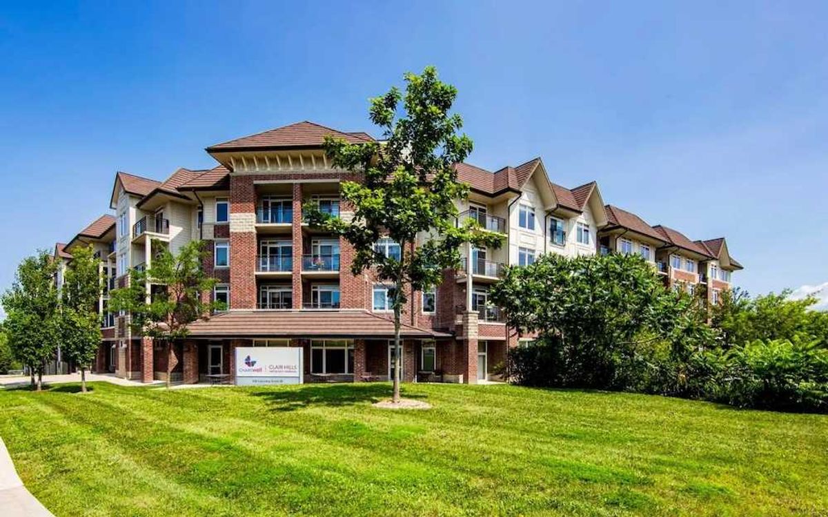
The Rosedale On Bloor. Nobu. Aquabella. Time & Space Condos. Toronto high-rise developers are punching the sky ever higher with a building arsenal that takes urban ascent to new heights.
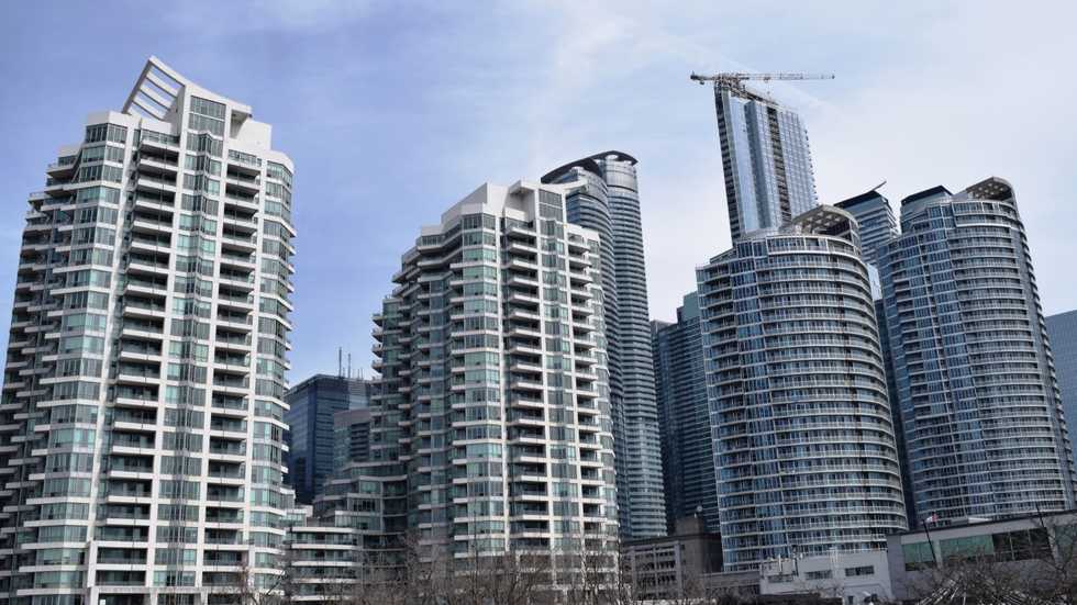
Like statuesque supermodels strutting Toronto’s real estate catwalk, the glass monoliths conspire a skyline as crowded as the DVP is thick, housing a population as diverse as the towers within which it lives.
For those of us in older, smaller buildings (at 39 floors we’re hardly vertiginous, by today’s standards) the current raft of hot ticket upstarts present challenges when it comes to maintaining desirability. But it can be done. We can attest, in fact, that even dated “ugly ducklings” can be morphed into beautiful swans — without the need for unrealistic investment.
Our best advice? “Spec up”. And by that we don’t mean staging (yawn) with Phalaenopsis orchids and a herd of strategically placed cushions. Preparing your home — to make it truly market appropriate — means pushing yourself a little bit harder.
As the well-worn adage proclaims, “speculate to accumulate.”
This in mind, we’d suggest a modest 5 per cent to 10 per cent of current value as an appropriate spend for auspicious updates (upon which we’ll touch shortly) to heighten your outgoing sale price by as much as 25 per cent.
When we bought our condo in 2007, it was already five years old and the drabbest penthouse we’d ever seen, though it did have potential.
Fortunately — for us certainly — its seller seemed less concerned about achieving anything beyond bricks and mortar value and was more focused on a quick sale and moving on.
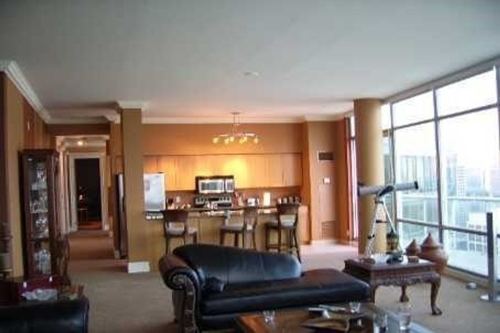
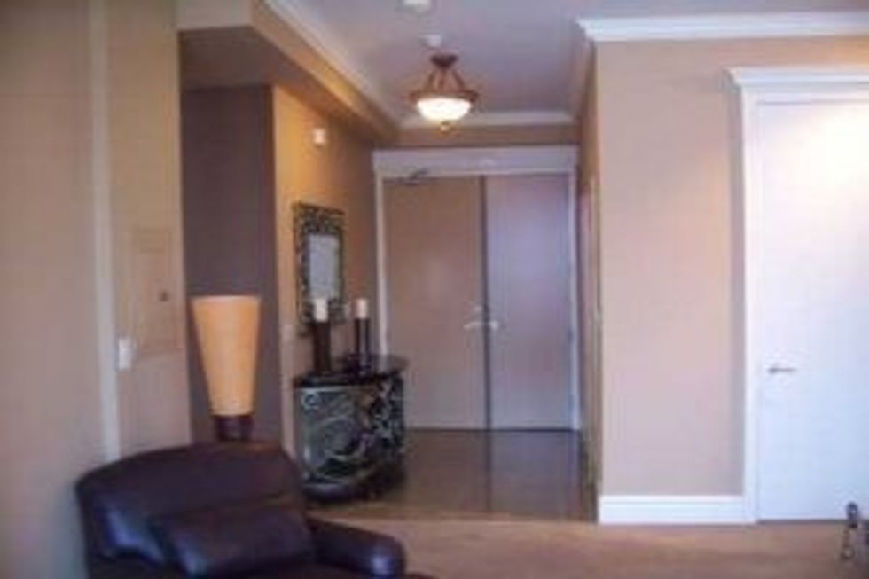
The prospect of monetizing via lifestyle quotient clearly hadn’t dawned on him. Finishes, as we found them, were basic, with shag carpet, a builder’s beige kitchen and similarly unprepossessing bathrooms. And holy crap: those paint finishes. And those dreadful banded walls.
Had our erstwhile seller made even a few key updates he might have squeezed significantly more dollars from his lakeside aerie. Aye, from even two canny Scots with an eye for a bargain.
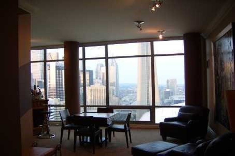
Spectacular skyline
On the plus side, we loved (and indeed still love) our older condo. The rooms are bigger, the ceilings higher and the spectacular skyline and lake views thrill us as much today as they did when we first took possession some 10 years past.
As a sidebar, it’s unlikely our vista will ever spoil — unless, that is, the city decides to raze the Rogers Centre and fell The CN Tower. But of course Toronto’s way too smart to do either of those things, right?
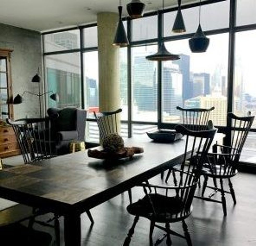
These days, our tired old girl has moved with the times. We’ve installed two new bathrooms (one lined in bookmarked Silver Wave marble — the other crisply attired in monochrome Caesarstone) that sparkle like jewels in our property crown.
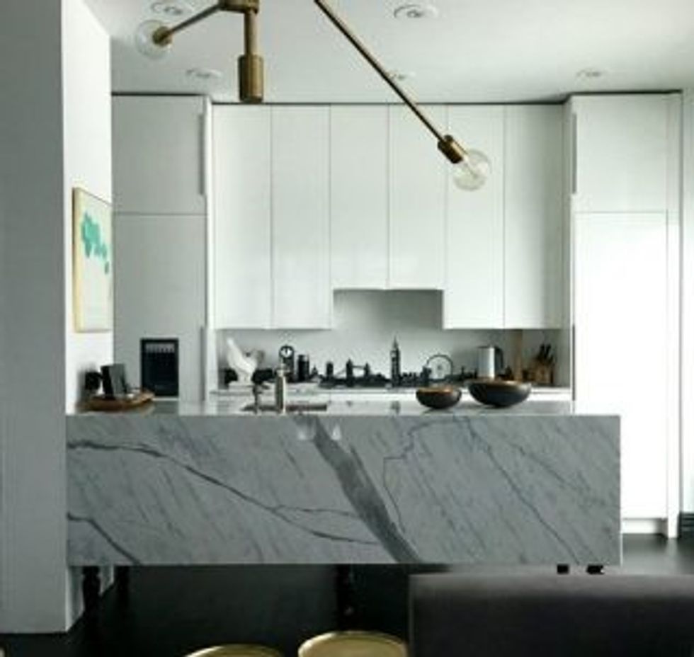
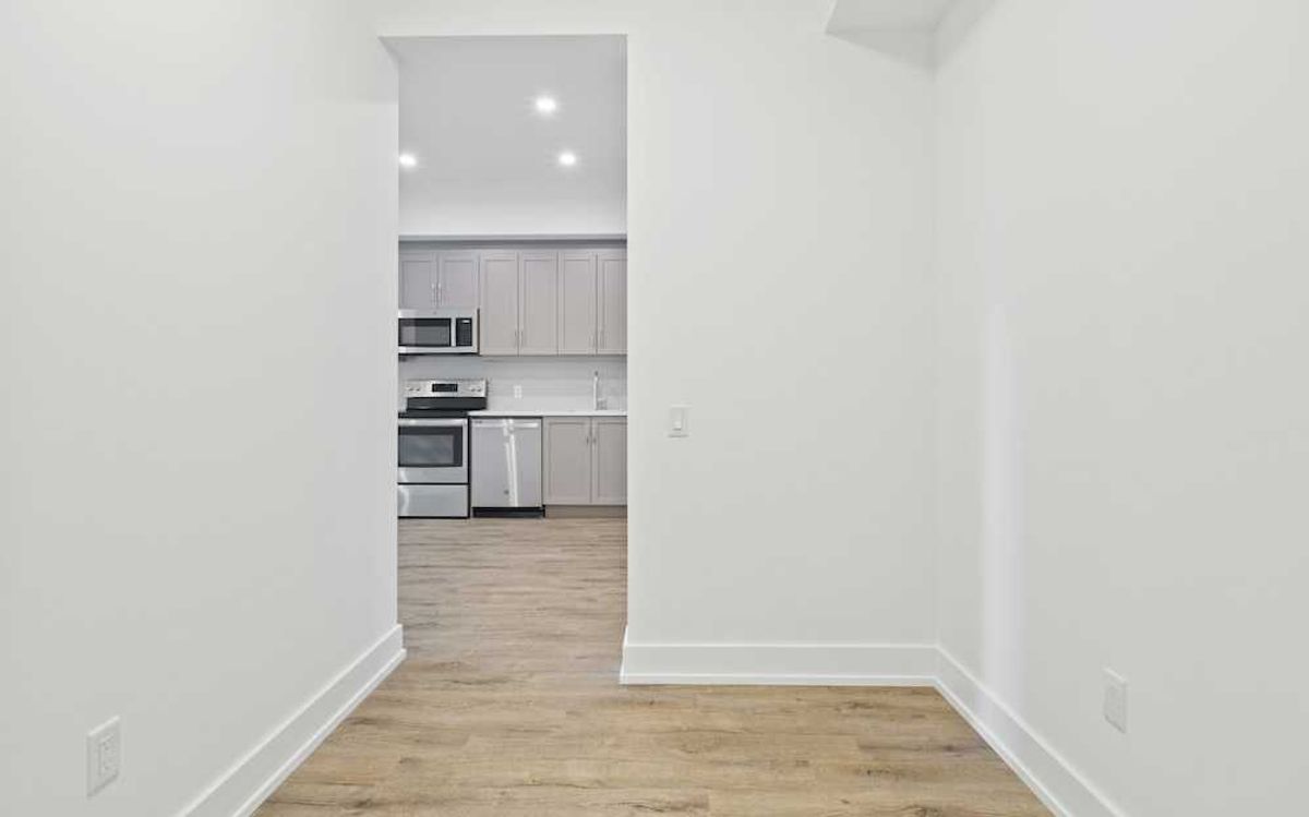
A further mod splash is courtesy of a glossy white kitchen with hidden appliances, ceiling-high cabinets and grey Carrara counters. Throughout the condo runs ebony flooring and an army of pot lights employed to flood the space with controllable illumination as and when required.
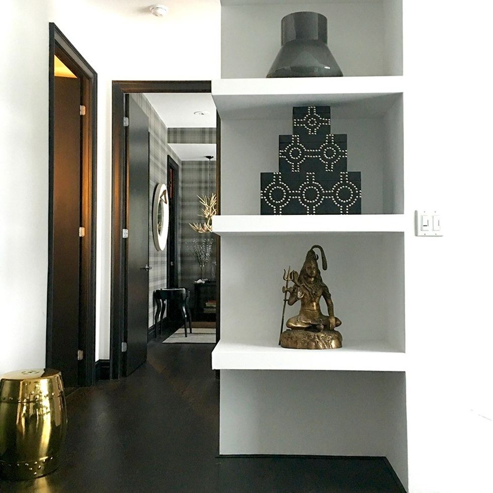
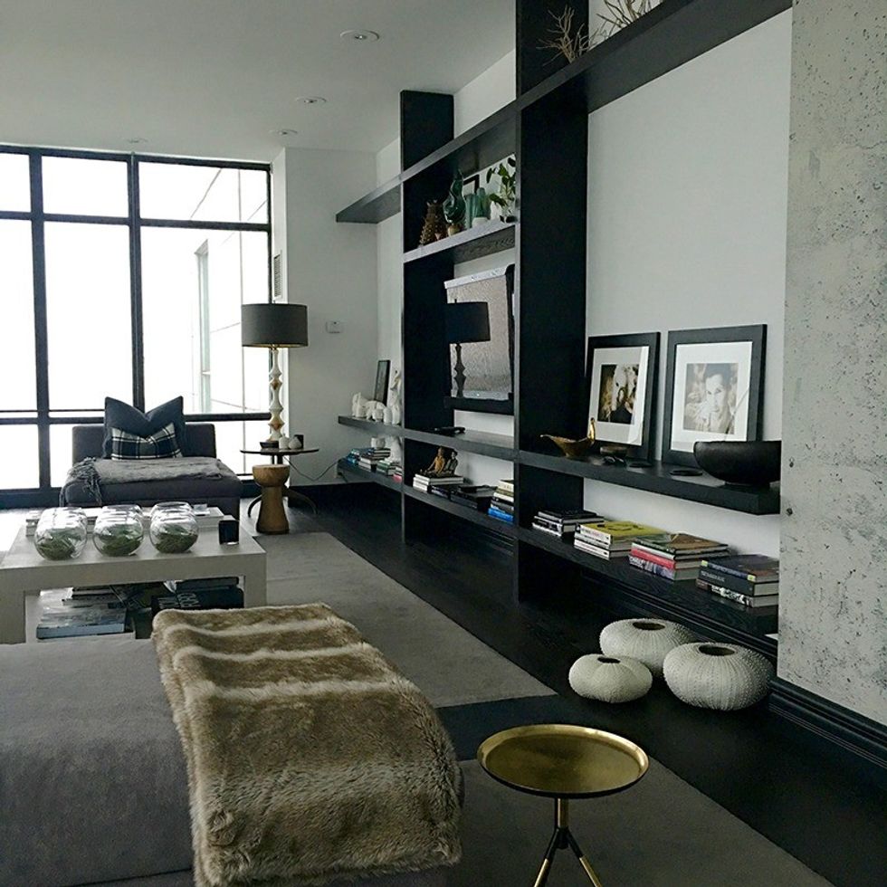
Spray finishing window frames inky black (with consents, of course from our condo board), acres of white latex and miles of concrete walls have systematically transformed the 39th floor suburban bungalow into a somewhat Bauhasian space. A space that will certainly provide a substantial profit come sales time, a generous return on a daily basis and ongoing pride in a job well done.
Cashing out 101 — Botox for buildings
Paint it out
Fact: Accent walls are one thing but buyers for the most part prefer neutrally painted spaces. Crisp white is our default mechanism but bone and whisper grey are also good news. Check out the Premier range at Canadian Tire for the market’s best value — and most efficient — paint.
Pared-back schematics will help bounce light around smaller, north-facing rooms. Come on: when did you last see a model suite painted library green or dining room red? If you just can’t do without a jolt of tonal titillation, specify a bold artwork or go wild with soft furnishings. But remember: less is more — let your space speak for itself.
Be fabulous with flooring
Many older condos still grace the market with thick, trip-hazard berber which, for some reason, is generally gold. Worse still, beige bathroom carpet that would challenge even the most determined gag reflex. Aye, bathroom berber, the work of the devil. Cheaper than hardwood, it was quick to fit and provided an — apparently — luxe look. Hmm. We’ll be the judges of that.
In 2017? Tear it asunder and install continuous engineered or hardwood flooring (to increase perceived proportions, forgo the mudroom tiled entranceway — rugs are less obtrusive and can be whipped out for washing as required) to max out dollar returns. In the condo market, buoyant as it is, buyers will offer less if they anticipate the hassle of installing new flooring.
Optimize circulation
Think model home scene setting to stimulate buyers. Clear foot passage to windows so views may be properly appreciated. Tidy up fenestration by swapping out billowing drapes for simple blinds and clearly define each room with its own function, rather than allowing hybrid bedroom/office/TV rooms to confuse your market.
Illuminating inclinations
Model suites seldom underestimate the power of lighting, their designers setting mood with cleverly positioned table lamps and overhead fittings to create atmospheric pools of light and shade. So ditch those cruddy track spots and opt for slicker recessed pots, fire regulations permitting. And, while you’re at it, trade in sockets and light switches for controllable updates that allow mood tailoring at the flick of a switch.
Kitchen sink dramas
Kitchens are a huge priority: if yours is less than ideal, it’s time to minimize weak points. But fret not, you needn’t break the bank when it comes to new fittings —try Altima Kitchens (which did ours) or Ikea, whose cupboards are great value. For a streamlined look, fancy up affordable cabinetry with integrated appliances, choose stone or quartz surfaces and swap out your bulky dishwasher for a modern drawer beauty by Fisher & Paykel. Keep clutter at bay and “counterscape” with a selection of sexy appliances such as Nespresso coffee makers and Dualit toasters. Remember: you’re selling a lifestyle.
Create a home spa
Shower curtains (bodily grease and mildew) be gone — a glass door wins every time. Updating an old sink vanity (try Gingers at Castlefield) will reap rewards, as will new tiles (visit Saltillo at Castlefield), replacement faucets and a smart new towel stand. If you have two bathrooms with tubs, consider removing the bath from one and fashioning a generous wet room with a rainhead fixture. Complete your reversion with a slick mirror and strategically placed luxury perfumes or aftershave and you’ll be well on the way to creating the spa-at-home vibe everyone loves.
Make common posh
Get to know your condo board and become cognizant of (and challenge, if appropriate) proposed improvements to entranceway, lifts and common hallways. Our own corridors were recently updated and we anticipate a new foyer and concierge station later this year. A modern approach sets the scene for a modernized condo, whilst demonstrating ongoing commitment to buyers.
Think of your dated condo as a classic car — while some old vehicles end up on the scrapheap, others become concourse winners. So if you’re moved to improve, polish those headlamps, oil that engine and hack up your high-rise like heat-seeking stagers on crack. Consider our counsel your starter flag and create the metropolitan pad of which you — and more importantly buyers — have always dreamed. And watch the dollars stack up.
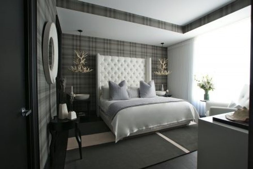
Here's how we updated our space ...
