Awe — that ambered moment, suspended in wonder.
Its effects can be overwhelming, or quietly moving. It can pass in an instant, or linger in your memory for years, forever connecting you to a time and place.
Of all the art forms, architecture has perhaps the greatest potential for inspiring awe: It delivers beauty, blows it up on a massive scale, and allows you to step inside.
So we invited Toronto architects to pause and reflect on this city. Which structures are most awe-inspiring to them? Responses were, invariably, a thoughtful contemplation of what they find striking, startling and beautiful. What leaves them awestruck. Here's what they had to say in their own words.
Richard Librach, Founder, Richard Librach Architect Inc.
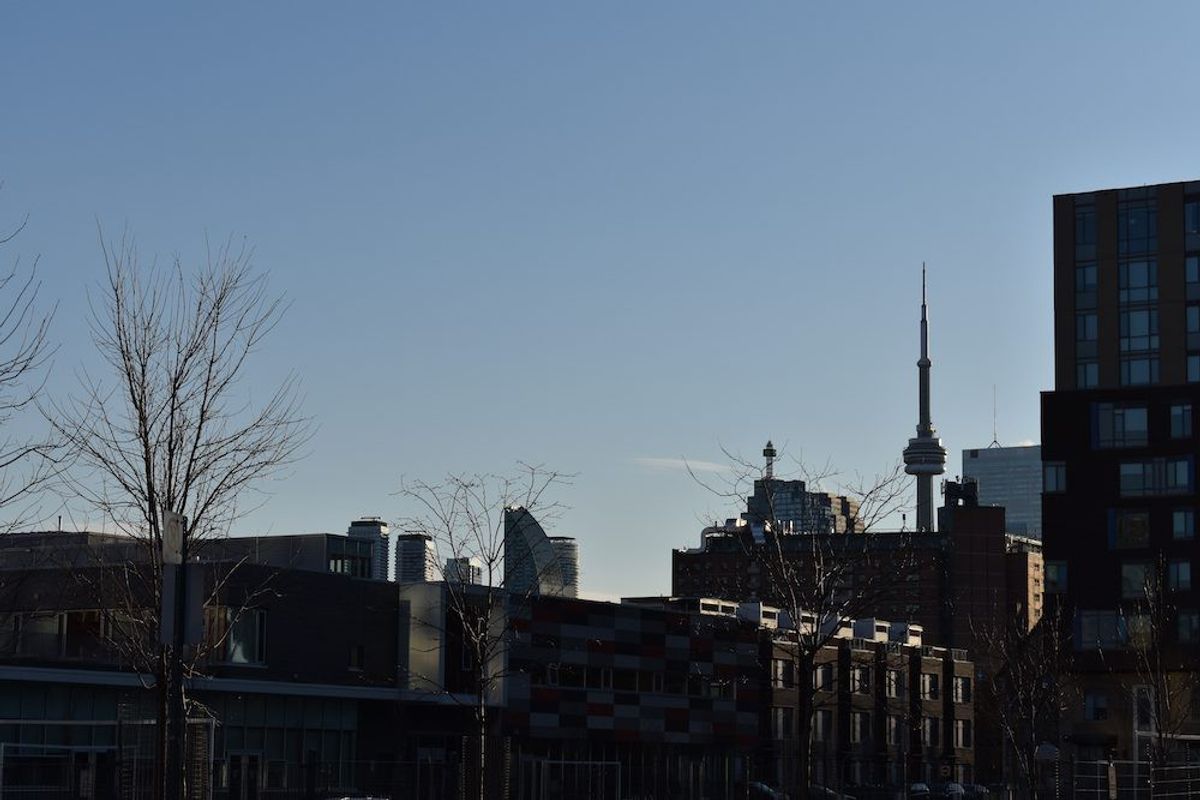
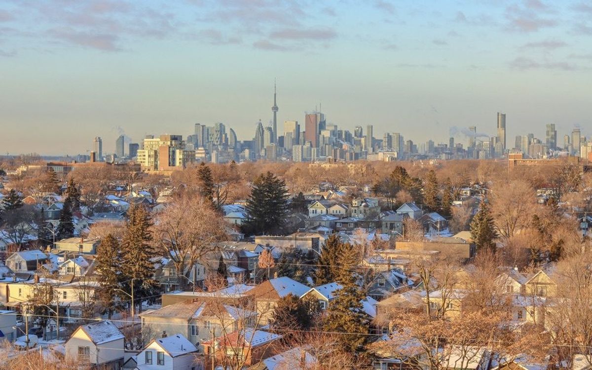
CN Tower
The CN Tower always inspires awe. No matter how many times I take it in from near or far, I marvel about the logistical brilliance that was required to erect it. And despite the engineering principals that make it possible, that its bravado fights off the aggression of our climate.
Galleria Italia
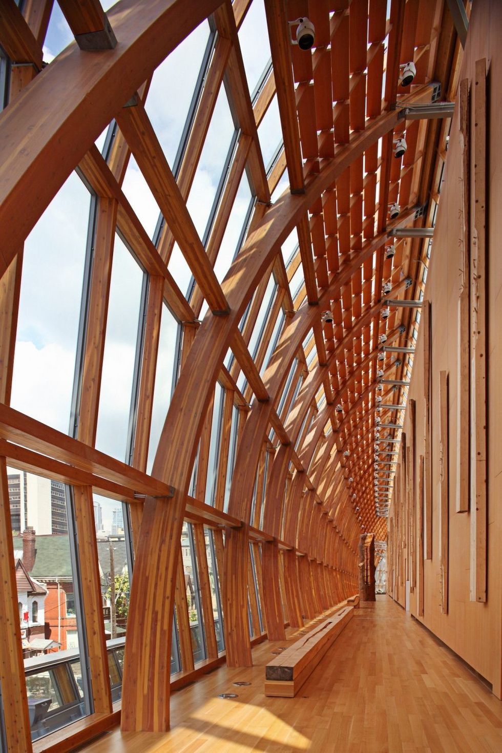
The brilliance of the Galleria Italia addition to the Art Gallery of Ontario. I return to the gallery specifically to enjoy this public space. I feel a reverence for the complex wood and steel detailing that delicately holds its glass skin. It offers gracious views of the busy Toronto street below.
With places to stop, congregate or contemplate the ever-changing expansion and contraction of proportions along its 180-length, the journey culminates in the Moore Gallery Space. This is the most intriguing collection of Toronto modern sculpture playing together.
Toronto Reference Library
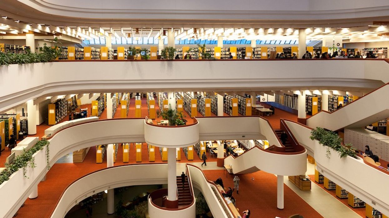
A close third is the Toronto Reference Library. Its gaping, naturally light-filled interiors are open for people watching. It manages to hold onto its '70s style way of just letting one kickback to study, sleep or daydream. The astonishing number of options within to learn or socialize in this public place can be exciting and intimidating, but somehow manages to remind one of home. The endless expanse of wall-to-wall carpeting, no doubt intended as sound dampening, takes me back to the shag rug of my '70s basement recreation room, where I used to go to escape to explore my older brother's record collection.
Rudy Wallman, Principal, Wallman Architects
Prince Edward Viaduct (Bloor Viaduct)
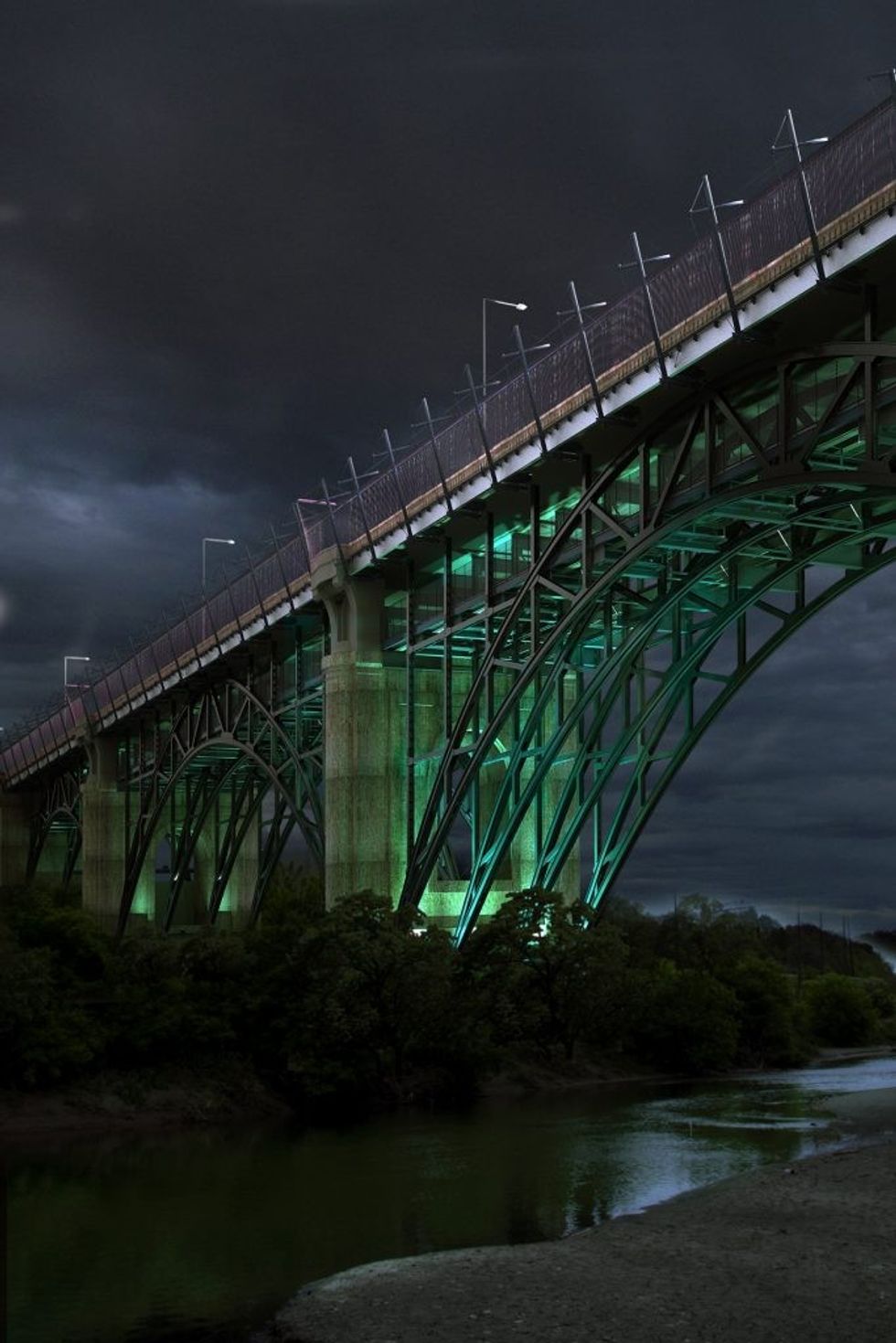
The Prince Edward Viaduct (Bloor Viaduct) creates a sense of awe on many levels. To begin with, it’s sublimely beautiful and this attribute — combined with the technical achievement of its construction — is what makes it so striking.
Furthermore, the design mitigates between the vast scale of the Don River Valley and the scale of not only people walking across its sidewalks, but also vehicles on its road and subway cars below. In this way, it takes its place not only as a man-made addition to the natural world, but also one that amplifies and beautifies that world, creating a larger whole than existed before its creation.
There are many other layers to its appeal. Its visionary design foresaw the construction of the subway. It’s the subject of a brilliant book by Michael Ondaatje. It has an element of the macabre because of its use as means for suicide, and the mitigation of that with the addition of the Luminous Veil of cables and lighting by Dereck Revington.
In short, it’s breathtaking, somewhat terrifying, and, in the end, just plain gorgeous.
Meg Graham, Principal, superkül
King Street West Area
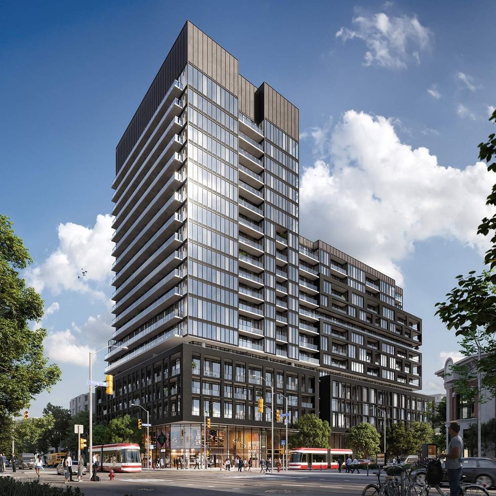
It has a thickness or depth to it, places to explore away from the flow of traffic and the storefronts and front doors. In this, it has a unique capacity to surprise and delight.
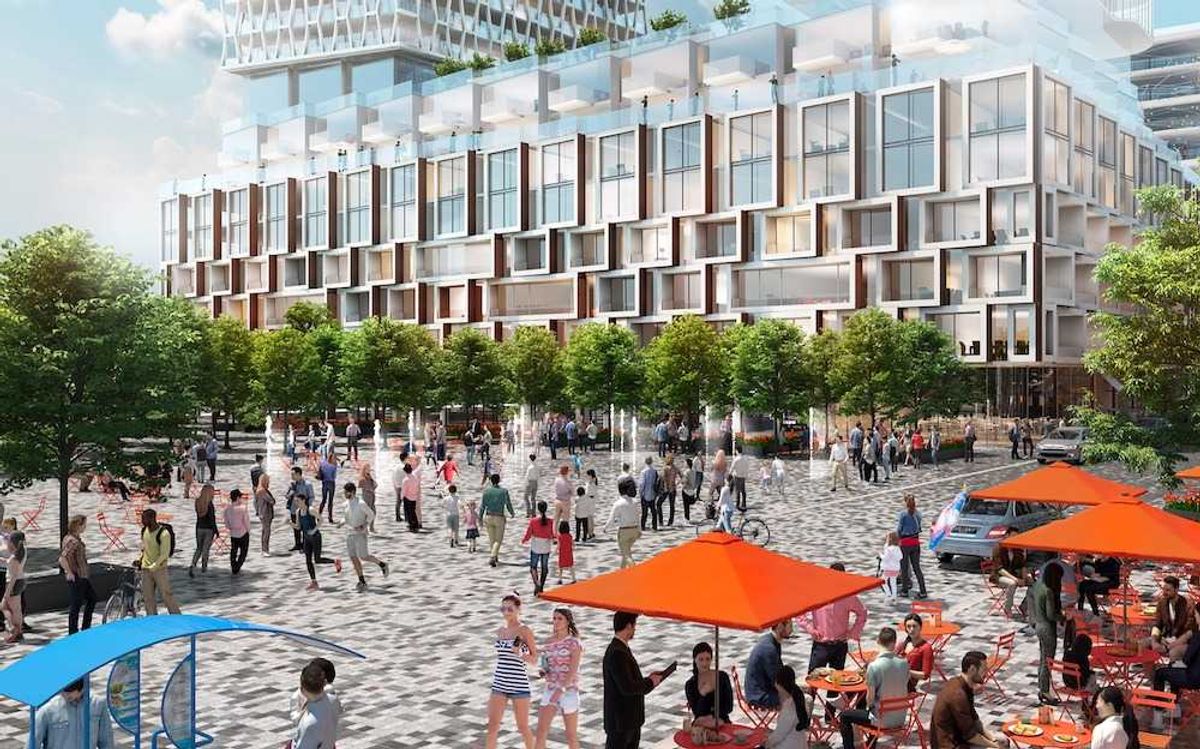
Originally a warehouse and light manufacturing area, it has a scale that’s allowed it to morph and evolve in a way that allows it to be a successful contemporary and pedestrian area. What was essential for its original use has made it a humanist, walkable downtown neighbourhood.
There’s so much there to build on, without eradicating any bit of it. It’s flexible enough as an architectural fabric. It’s got a richness about it.
With all of the growth Toronto has experienced, we’ve gotten to a point where the public space that remains isn’t scaled to the density of development. A lot of our public spaces and sidewalks are congested and difficult to navigate.
There are parts of downtown that feel like 10 pounds of stuff in a five-pound bag. Whereas King Street West has a kind of graciousness and human scale that will endure, even with some additional height grafted on. It’s just a really comfortable place to be, which is why I love it.
Roland Rom Colthoff, Director, RAW Design
Toronto Dominion Centre
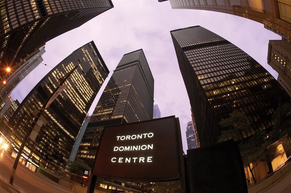
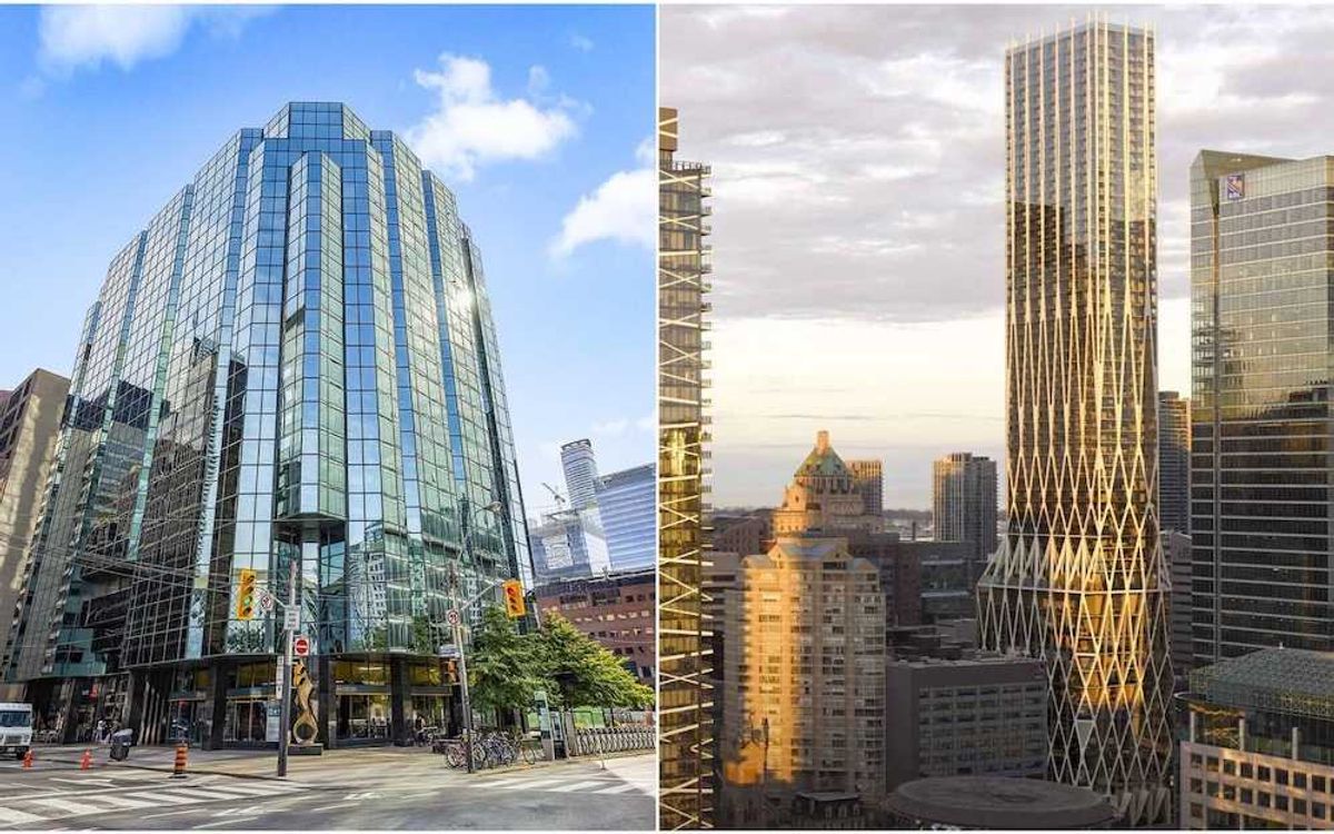
I am likely going to pick a building about which many others are wont to write, the TD Centre on King. While part of my appreciation for this building might be a result of the enforced study of the block and laudatory descriptions by all architectural historians during my school years, it is also simply from repeated walks around and through the block and glimpses of the development from my sailboat in the harbour.
The subtle interplay of the simple forms of the buildings and their way of framing, but not containing, the space around them leads to an intriguing experience as a pedestrian. This is particularly striking at night when they are partially and mysteriously lit. (Why one office and not another?) And it's most arresting when the night is a bit foggy.
The banking hall is (still) a remarkable structure with its large long span beams supported by impossibly slender columns. It gives what is usually the most mundane of experiences, queueing up to see the teller (although few people need do this anymore) a fleeting sense of beauty and is ennobling. Which is really what all buildings should be trying to do.
