More than anything, the Royal Ontario Museum’s new Bloor Street landscape is a reminder that architects are better at buildings than the spaces between them.
The ROM’s latest contribution to the public realm, designed by local practitioner Siamak Hariri, is quite lovely. But it misses the mark by a mile.
READ: 10 Reasons To Buy In The Bloor-Yorkville Neighbourhood
As Jane Jacobs pointed out, the city is not a work of art, it’s a place where large numbers of people live, work and play. The problem here is that people are almost an afterthought, meant to do little more than admire the museum – and the architect – for their good taste, sophistication and desire to make Toronto more beautiful.
While one applauds the good intentions, the results do little to animate the empty spaces that comprise the ROM’s stretch of Bloor. The irony is that it would have been relatively easy to bring life to the sidewalk. It forms a natural linear piazza, one that calls out for human interaction. Yes, Hariri’s variously shaped limestone planters are a visual treat, but they offer little more than places to sit.
This is fine as far as it goes, but there could be so much more.
READ: Is Toronto Missing Out On Its Moment Of Greatness?
The key to success in a project such as this is to integrate the public realm into the urban infrastructure, to make them a seamless whole, one element inseparable from the other.
Think of the grand staircase at the Metropolitan Museum of Art in New York: not only does it lead to the main entrance, it also serves as a place to meet, gather, sit, wait and simply watch the passing parade on Fifth Avenue. It is a practical feature as well as a landmark.
And by the way, it was added in 1975.
READ: TV Host Jackie Redmond Talks Life In Toronto Vs. NYC And Shows You Her New Home
Sadly, the ROM hasn’t managed to capitalize on comparable opportunities.
In 2017, when Hariri redesigned its former main entrance on Queen’s Park, the staircase was refurbished, but without any effort to turn it into a significant piece of the public realm. By contrast, the mundane Bloor entrance sits at street level. It’s the most obvious misstep of Daniel Libeskind’s 2007 addition; it possesses neither the heft nor the sense of occasion to serve any larger civic purpose.
Presented with a similar situation, many European cities would bring in one of those ubiquitous portable food kiosks and set it up with a dozen tables and chairs. The example that comes to mind is the small octagonal structure found throughout Lisbon. It is a relatively quick and easy way to reclaim spaces that are accessible but unused.
READ: The Story Behind Toronto’s Old City Hall And Why It Needs To Be A Museum
The truth is that the biggest attractions on the ROM’s east side were the food truck and hot dog-stand that drew passersby like flies. The only problem was that there was a lack of places to sit and eat. Now that the portable food dispensers seem to have disappeared, benches formerly in front of the ROM on Bloor have been moved to Queen’s Park.
In any case, it’s a safe assumption that the city, let alone the ROM, would reject the idea of a Euro-style kiosk for the usual disapproving by-laws. Still, the museum, always desperate for a larger audience, could use something like an outdoor café to soften its looming aloofness.
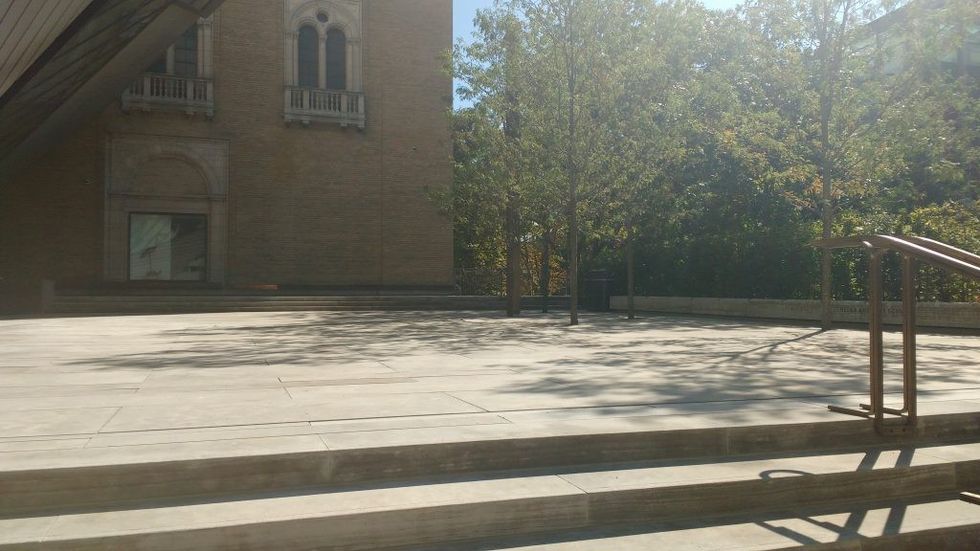
Instead, the ROM opted for planters and a “performing terrace,” an elevated space devoted to public concerts and productions, many of which will take advantage of the Royal Conservatory of Music next door.
Nice idea, but because it will be used mostly on weekends, Torontonians will come to think of it as a quiet and frequently empty outdoor room that’s a good place to study or be alone. On a warm and sunny afternoon last week, three people had the terrace all to themselves. While a father played with his infant child, a woman was hard at work on her laptop. A few days later, even warmer and sunnier, the terrace was deserted.
Perhaps that’s unfair. Perhaps the tables and chairs were fully occupied minutes later. One doubts it: because the space is set back from the sidewalk, it demands a level of commitment that most pedestrians aren’t prepared to give.
Still, it has enormous potential; most obviously in the sidewalk-facing staircase that could have served as a seating area and also in the “stage” above that needs to be opened up and made more psychologically accessible.
READ: Toronto’s Museum of Illusions Is About More Than Just Getting The ‘Gram
The challenge is to create a sense of connection to encourage spontaneity and to transform a space that reads as closed when not in use to one that feels welcoming all the time. The problem here was the decision not to make the stairwell larger by extending it to the west end of the site. That would have increased its presence on Bloor while making it more attractive as a seating area. Instead it is cut short by a planter, an underground stairwell now closed off and a largely unnecessary pathway.
Good intentions notwithstanding, the ROM’s $5-million public realm enhancement is a missed opportunity. Given the importance of the intersection, not to mention the museum, that’s a loss not just for the museum but the entire city.
The museum would have been better advised to hold a design competition for the site, and ensure a larger discussion about the choice. After all, in an open and inclusive city, decisions about the public realm should be made in the public realm.


