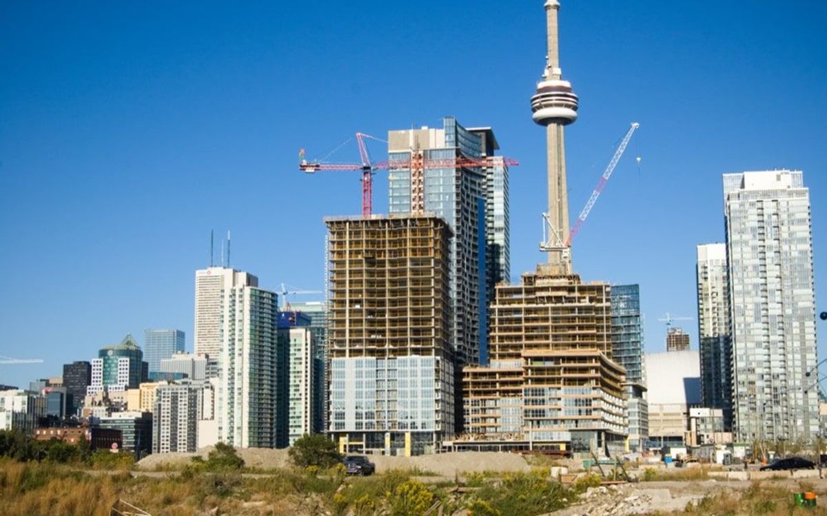
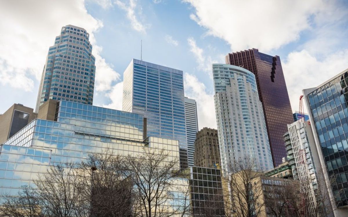
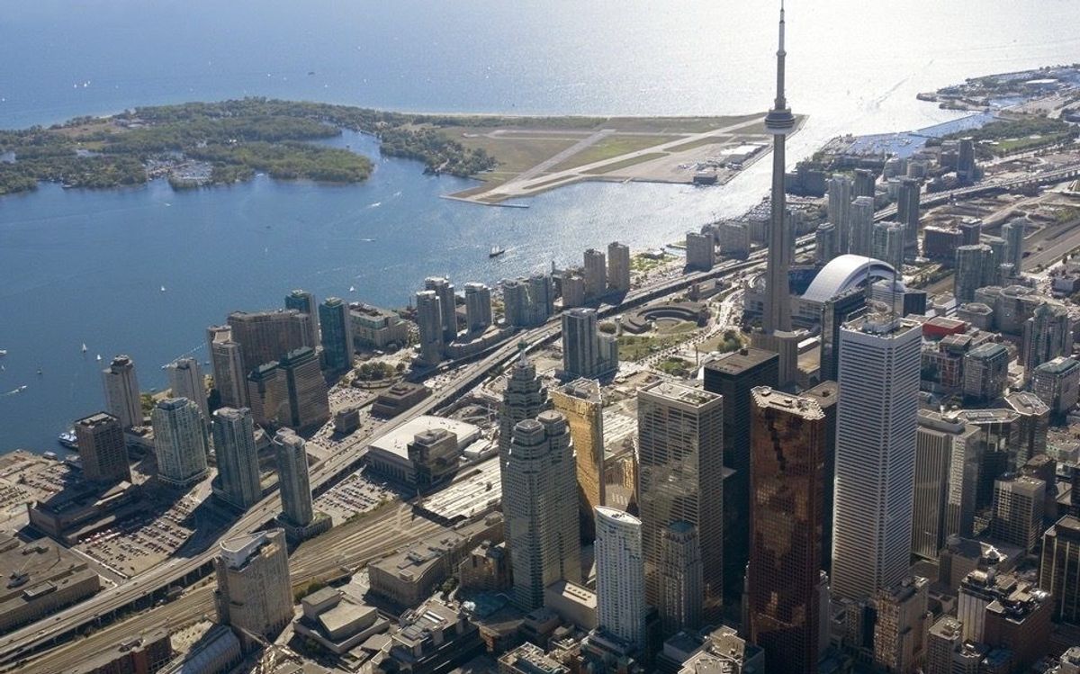
Toronto has a self-esteem problem; stepping outside the confines of its many well-tended neighbourhoods, one finds a city consumed by a profound sense of unworthiness, a community willing to settle for mediocrity.
Despite its wealth, it is a city that thinks poor, a city convinced that to spend on anything but the cheapest is improvident, profligate, wasteful and even sinful. Worse still is a culture of we-can-do-without-it disapproval that adds to the deep-seated suspicion of anything that smacks of fun or pleasure, let alone beauty and excellence. We opt for the bare minimum. Good enough is good enough.
Toronto councillor Josh Matlow made the point in an exasperated tweet he sent out earlier this month. “We love CafeTO,” he wrote. “But I’m asking for more inspiring design, and far less ugly concrete and orange cones. Let’s design a beautiful city.”
A beautiful city! Inspiring design! What a concept.
CafeTO was conceived as part of the city’s attempt to alleviate the damage wreaked upon local bars and restaurants by the pandemic. It was a splendid idea, all the more so for how it took space from roads long since handed over to vehicular traffic and transformed it into an occasion for pedestrian pleasure. Municipal love in a time of COVID.
But then the works department shows up with jersey barriers, concrete mega-blocks and emergency pylons and turns the streets into something that resembles a series of construction sites. When Matlow says “ugly,” he means ugly.
A well-intentioned attempt to revitalize Toronto, to make itself more engaging, entertaining and enjoyable becomes instead a reluctant and grudging exercise in civic coarseness.
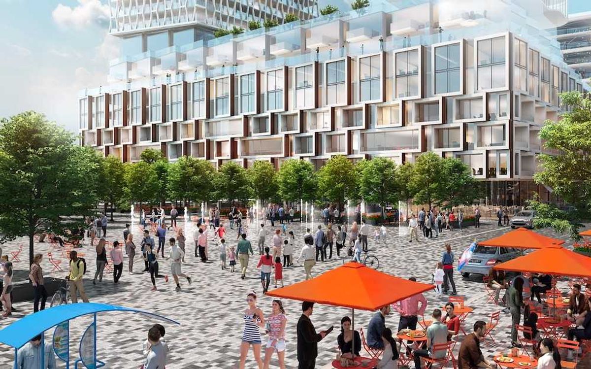
READ: Plan for High-Rise Density in Regent Park a Missed Opportunity
What was city hall thinking? CafeTO installations are a default response to a situation that exceeds the capacity of a municipal bureaucracy more accustomed to filling potholes, digging ditches and collecting garbage. Matlow’s poignant plea for a “beautiful city” sounds almost quaint in the context of a community run by stolid civil servants and political careerists whose parsimony leads to nothing more than the usual promises of low taxes and the inexorable reality of bargain-basement services and a nasty public realm.
As for architecture, in Toronto it is bogged down by the pressure to design and build as cheaply as possible. Governments in Canada encourage this by choosing the lowest bid. In other jurisdictions, top and bottom submissions are discarded, eliminating any advantage of lowballing budgets.
What gets lost in the race to the bottom is the public realm -- everything from streets and sidewalks to recreation centres and even bus shelters. Yet these are the elements that address the desire for more than basics. They speak of how the community sees itself. Ultimately, they reveal who belongs, who doesn’t and what the experience of the city means to its inhabitants, whether they are valued or not, whether they settle for less or demand more.
Let’s not let the media off the hook; the press bears considerable responsibility for making Toronto -- and Canada -- a design desert: it greets any suggestion that government spend more of our “hard earned tax dollars” on what it views as aesthetic frills with loud condemnation. Pundits are more at home scoring easy points at government expense than creating civic value.
The decline in public architecture is the inevitable result of the decades-long attack on the public realm in all its various forms. The obvious exception is the Toronto Public Library; like all public institutions, TPL is chronically underfunded, but has managed consistently to make a little go a long way.
Looking to Other Cities for Inspiration
Still, that rarely leads to the sort of landmark architecture that brought the Calgary Central Library to international attention and acclaim. Designed by the brilliant Norwegian/American architectural practice, Snøhetta, this remarkable 2018 building is part of Calgary’s physical and cultural infrastructure as well as a civic icon. In addition to serving as a library, it incorporates an LRT line and connects downtown Calgary with the city’s East Village.
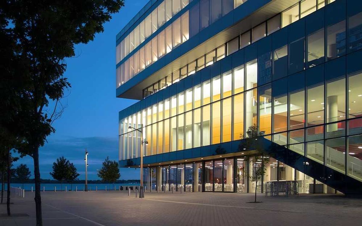
This sort of innovative architecture remains well beyond the limit of Toronto’s stultified planning department and its stumbling council. Incidentally, Snøhetta’s local contribution, the 2015 Met University Student Learning Centre, helped revive a stretch of Yonge St. that befuddled post-amalgamation city leaders for years.
Speaking of Yonge, in 2020 when council finally approved plans to humanize the street between Sheppard and Finch, it was only after a decade of prodding and persistence by the indefatigable Councillor John Filion. Council had rejected the scheme twice largely because of worries it might hinder the morning rush hour from suburbia. But don’t hold your breath; construction isn’t expected to begin until 2026. A lot can happen between now and then.
As much as anything, the fate of Yonge is a painful reminder that ultimately urban greatness depends more on planning than architecture. The latter is hugely important, of course, but without solid planning -- i.e. a clear vision -- it isn’t enough. In other words, Toronto’s slouching towards ugliness is symptomatic of a larger malaise, not its cause. Without political commitment, citizen engagement and decent planning, all the architecture in the world won’t make a difference.
