Winter’s palette of greys and browns leaves us bleary and sluggish, longing for splashes of bold colour. As the mounds of dirty snow start to recede, we glimpse one of the earliest signs of spring — those first scrubby patches of green.
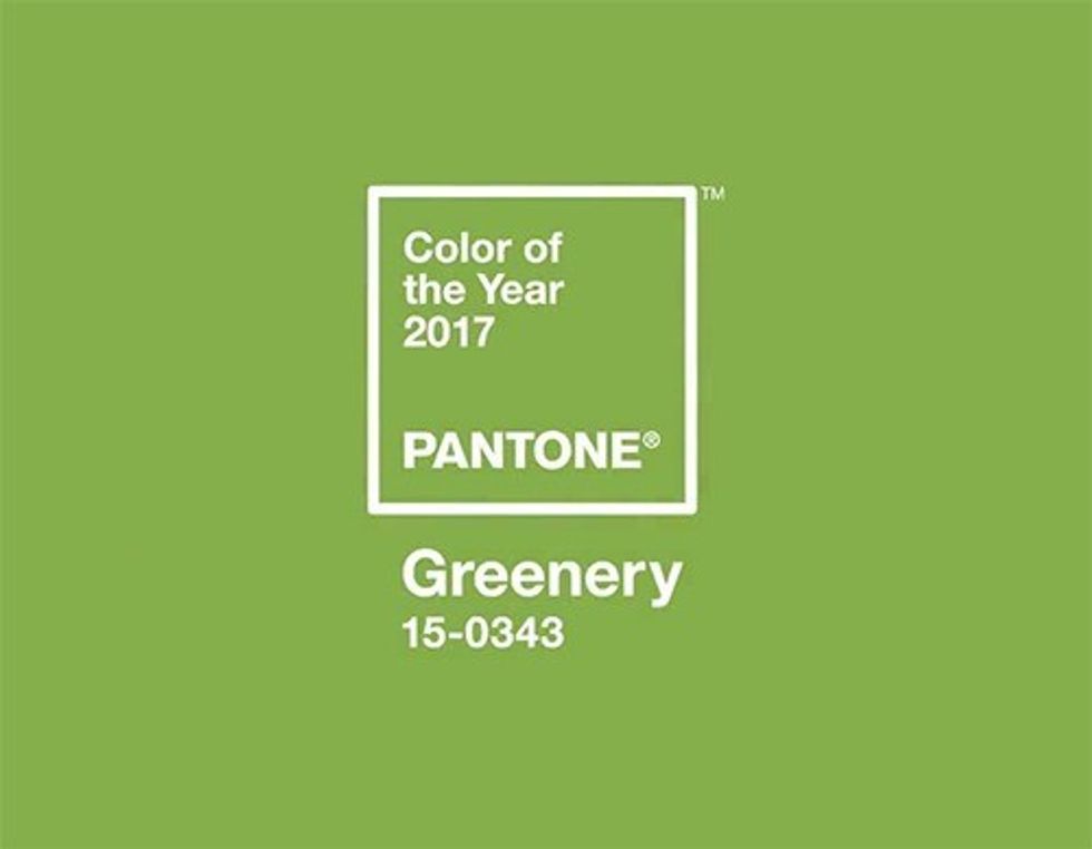
“Greenery bursts forth in 2017 to provide us with the reassurance we yearn for amid a tumultuous social and political environment,” says their executive director. Touché.
Barbara Nyke, principal and interior design professional at NIKKA DESIGN, calls this shade “exhilarating and vibrant,” reminiscent of forests, gardens and the optimism of spring.
“This hue can create both exhilarating and calming moods,” she says. “The mood of a colour will also depend on the sheen level, the rooms they're used in and the amount of natural light as well as on the existing lighting levels — the effect of Greenery can change throughout the day.”
Nyke says she likes colours such as Greenery in kitchens, bedrooms, bathrooms or sunrooms; she doesn’t favour it in living rooms, dining rooms or foyers. And, as with any trend, she points out that you don’t have to stay married to the exact shade.
“Treat Greenery as your inspiration to find a green hue that speaks to you and that suits your decor,” she says. “Have fun and experiment … The options are endless for the Colour of the Year 2017.”
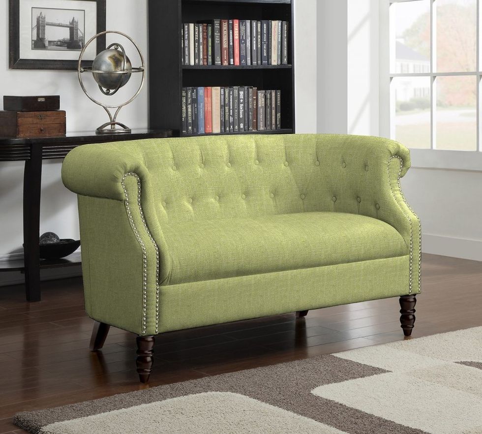
5 unexpected ways to use Greenery
Whenever a bold new colour makes a splash, it’s all too easy to add some throw pillows and bathroom towels, and call it a day.
But if you want to kick it up a notch, try Nyke’s suggestions for truly stunning, high-impact splashes of green. Go big or go home.
1. An LED backlit 4-foot by 6-foot raised panel, colour blocked in Greenery, would make a stunning contemporary gallery wall, along with other panels in bold hues. Or use the same raised panel, but with Greenery behind the panel on the wall, and the raised panel clad in a contrasting colour, a light stone (like limestone), or a textured wallpaper.
2. In a home with an open staircase, paint the stair treads in high-gloss Greenery — this would make for a strikingly modern treatment.
3. A bedframe with exposed headboard, side rails and/or footboard in bold or deep green.
4. A dining room or living room or study, with a monochromatic scheme, refreshed with dramatic and unexpected curtains or carpet in Greenery, or a similar hue.
5. A high-gloss/lacquered green ceiling in a bedroom, study or powder room.
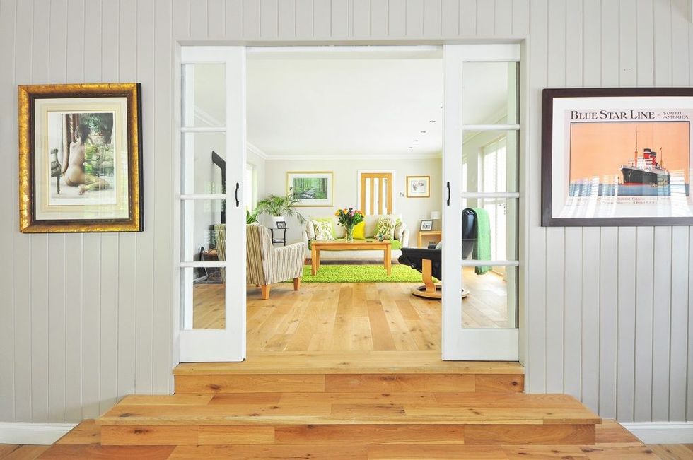
Quick tips from NIKKA DESIGN
Colours to complement Greenery: Cobalt blue, navy blue, marine blue, pale hint of yellow, crisp white, jet lacquer 
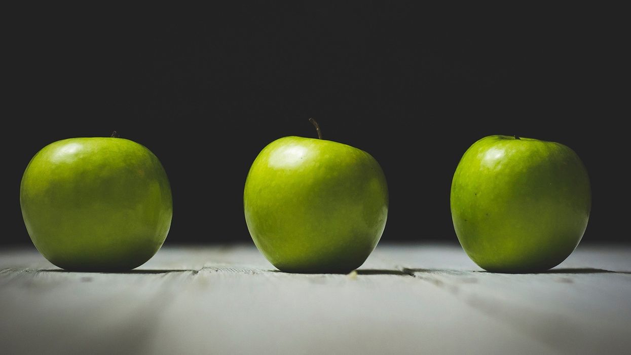
For a more subtle way of introducing Greenery to your home, decorate with a green succulent, or a bowl of fresh green apples. Or for more typical accessories, try vases, candlesticks, a toss cushion or even a coffee maker.
Also look for coloured patterns where green is one of the colours.
A few facts about green
China believes green symbolizes fertility and happiness. It is considered the most important colour in Islam, representing the lush vegetation of paradise and found in the flags of almost all Islamic countries. Green is a symbol of Ireland, aka The Emerald Isle.
Green is often associated with safety and permission — a green light means go, a green card in the United States means you can stay.
The idiom “green with envy” is believed to originate from William Shakespeare: “Beware, my lord, of jealousy; it is the green-eyed monster …” (Othello)
Green is also associated with youth and inexperience — think unripe fruit.
Mona Lisa wears green.
