After more than a decade of discussion, and timelines with dates that are now far in the past, construction has finally begun on the new Vancouver Art Gallery, with City officials and project collaborators celebrating the milestone at a ground-breaking ceremony on September 15.
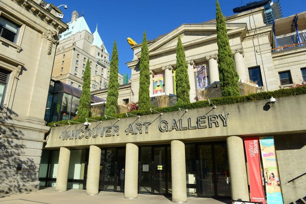
The new gallery is rising at 181 West Georgia Street, at the intersection of Cambie Street and W Georgia Street, replacing Larwill Park, a parking lot that was formerly a sports field. The site sits seven blocks away from the current Vancouver Art Gallery — a former British Columbia provincial courthouse building that has housed the gallery's collections since 1983.
Discussions around a new gallery building arose in the aughts, as the gallery realized a need for more space for both its displays and storage. Deciding on a location, however, went through some back and forth. Larwill Park was initially identified as the potential new site but was then dropped in favour of a location near the Plaza of Nations by False Creek before a later Council reversed the decision and approved the Larwill Park site.
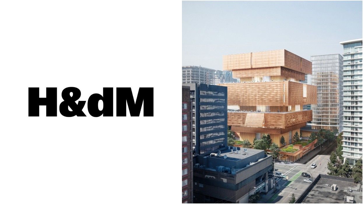
In 2014, Switzerland-based architecture firm Herzog & de Meuron — who have designed numerous public buildings around the world, including the Tate Modern in London — was chosen to design the new gallery and unveiled their plans the following year, with a completion date target of 2020.
The project was not able to get off the ground, however, as a result of funding issues, including a dispute between the provincial government and federal government over $100M. The total cost of the project has been estimated at $400M, with funding currently at $340M as of this month, including $100M from the Province, $30M from the federal government, and the rest via private donations, most notably $100M from Polygon Homes Chairman Michael Audain, whose own art collection is housed in the Audain Art Museum in Whistler.
According to the Vancouver Art Gallery, the project is now in its final fundraising push and construction is expected to be completed in 2028. The new gallery will double the current exhibition space, and will also include dedicated areas for the Asian Institute of Art, an Indigenous Community House, and a 265-seat state-of-the-art theatre
Along with Herzog & de Meuron, the Vancouver office of Perkins + Will is serving as the executive architect. With a focus on the environment and sustainability, the new Vancouver Art Gallery will be built to zero-carbon building standards and will feature mass timber in its construction.
In an interview with STOREYS, Simon Demeuse, Partner at Herzog & de Meuron, dives in to the design of the new gallery, the various changes that have been made to the design, and how the project team is going to use and feature mass timber.
After the site was finalized, where did the design of the new Vancouver Art Gallery begin? Were there some core tenets the team wanted to meet with the design?
We approach all projects with a need to understand the specificities of place, culture, client, collaborators, and beyond. We visited Vancouver frequently, met numerous times with all stakeholders, and looked at the site and its urban context closely.
Lawrill Park today is a parking lot. Historically, it has been a park and a gathering place for sports events and performances. Originally, pre-contact it was a place of trade and exchange. A place of crossing from one place to the next. It is still that today, as it sits at the junction of three very active neighborhoods on the downtown peninsula: Yaletown, Gastown and the Central Business District. One can always find people crossing the site on their way to and from one of the adjacent neighborhoods.
It is important to make a gallery that continues this act of crossing — to meet people, have an art experience or simply get a coffee. An urban and active crossroads. This is where the idea of an open, accessible and non-ticketed courtyard originated.
In order to allow this crossing, the site is kept as porous as possible. The main gallery building is lifted up, becoming a vertical museum. To go vertical with a public building is interesting, especially in the context of Vancouver, as it gives equal weight to a public building as is given to the surrounding tall private developments. More importantly, it allows the public to experience Vancouver from above with sweeping views of the city and natural scenery beyond. In many cities, Vancouver included, this is a viewpoint often reserved for private parties.
This is how we started pursuing what we feel is a very democratic concept, along with our local team and clients, of a low and open courtyard building with a tall, lifted Gallery at its center.
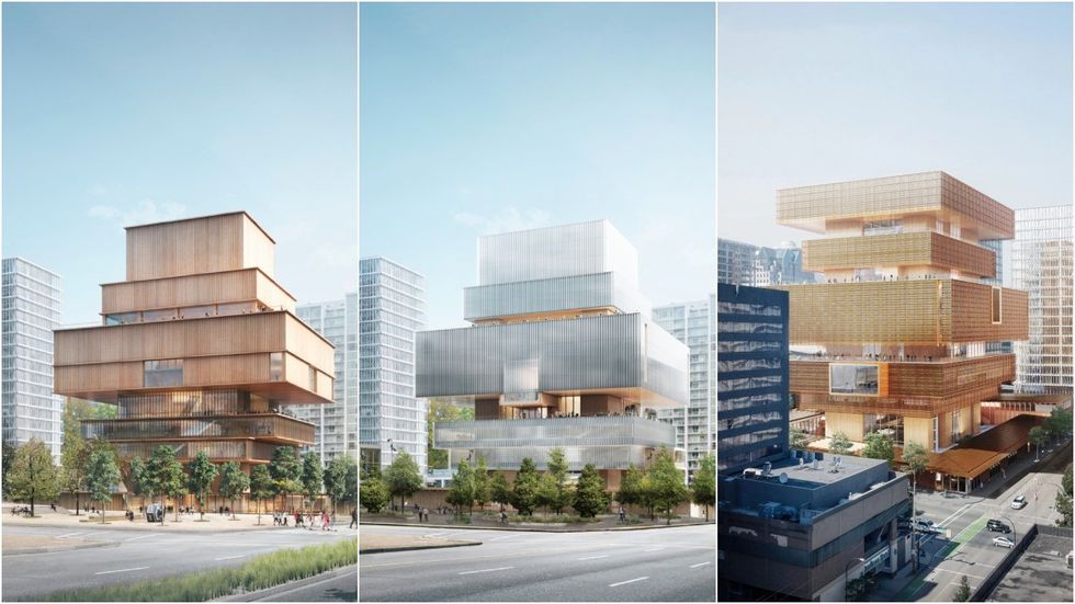
This current design is the third iteration. What was it about the first and second iteration that you felt needed to be reworked or improved?
The principal concept of the design of an open accessible courtyard with a vertical gallery structure has remained. Since the design was first conceived, the needs and requirements of the project have changed and the proposed building has been adjusted to accommodate these changes. This is quite common as projects move forward over time.
The most significant changes are the relocation of the lobby, auditorium and library. The courtyard has been planted more densely, and larger art spaces have moved to the top of the tower. All of these adjustments have had an effect on the overall building form and massing.
The throughline of all the iterations is the general structure of rectangular blocks of different sizes stacked atop one another. Where did this idea come from and why has it been so important?
Vancouver is a city where people really enjoy the outdoors. It is a city with a mostly mild climate, but it rains quite a bit. To offer an inside-outside experience in the vertical, we stacked volumes of different sizes on top of each other to create outdoor terraces adjacent to art spaces, education spaces and event spaces. The larger volumes above provide shelter for spaces below, while the smaller volumes on the lower portion of the tower allow sunlight to reach the courtyard.
The symmetry gives the building an equal visual presence in all directions, inviting people from all four sides and adjacent neighborhoods.
I understand the building facade was designed in collaboration with Coast Salish artists. What did that collaboration look like and where can we see it in the design of the building?
Collaboration with artists is a key part of our practice — every collaboration broadens our understanding of what architecture can do. The outcome of an exchange with artists is always open and unknown, and it provides an opportunity to engage in a process to work towards a novel result. We welcomed the opportunity when asked to collaborate on the Vancouver Art Gallery facade with a coast Salish artist collective. The four artists represent the three coast Salish host nations: Debra Sparrow, Skwetsimeltxw Willard “Buddy” Joseph, Hereditary Chief Chepximiya Siyam’ Janice George and Angela George.
We met frequently and learned about coast Salish cultures, art practices, historical research and traditions. Together we became particularly interested in the potential of translating the texture of traditional woven woolen blankets into a building skin. The blankets, made from untreated natural fiber, look uniform and singular in texture at first sight. However, the geometry of the weave is intricate and varied, which becomes apparent when seeing the textile from different angles and as the fabric folds. These were perceptual attributes we felt would fit the gallery design well and make the massing more approachable.
Like a Salish blanket, the facade of the Vancouver Art Gallery gives a calm, uniform appearance; at the same time, it is also rich in texture and geometric variation, which becomes more or less apparent depending on the vantage point and daylight conditions. It is indeed a façade inspired by traditional Salish weaving techniques, but it is also a unique and contemporary interpretation, not a caricature of a traditional weave. Copper-toned metal was jointly chosen as the main material, as copper holds a significant meaning for many indigenous people across North America. It is also a material we have worked with on many buildings before in our practice.
The process and exchange with the artist collective is not only about history and tradition, but also about the present and future of the residents of Vancouver and beyond. Weaving is a skill of all people and copper is a material that has an important meaning in many different cultures. Therefore, we believe that the building and its facade will be inviting to all visitors.
The new gallery is expected to meet Zero Carbon Building standards. How does the architecture contribute towards this?
Through pursuit of the Zero Carbon Building standard, the design strives to deliver not only a high-performance, low-energy use building, but one that seeks to drive down whole life carbon emissions associated with the building envelope and structural design.
The building volume's stacking form is arranged as such to provide a lot of covered exterior spaces which at the same time shade the building's façade and thereby reduce the heat loads. This inside-outside approach with generous overhangs and awnings, both around the courtyard as well as in the vertical building, immediately makes the project sensitive and responsive to its exterior conditions.
Did you look to any buildings here in Vancouver or around the world for inspiration?
References are always a key part of our design process. For the gallery, we visited many buildings in and around Vancouver and were also able to travel north to see traditional long house construction.
It was of particular interest to see how some of the west coast modernism around Vancouver was influenced by the elemental approach of Indigenous architecture. There is no one building in particular which inspired us more than others, but the context in British Columbia influenced the design of the courtyard buildings as very open wooden structures, adjacent to dense gardens. The decision to make the Gallery a vertical building oriented to the outside was also a response to the immediate surroundings.
The new gallery will also utilize mass timber in its construction. Will the mass timber be featured on the inside as well? If so, where will visitors be able to see it?
The courtyard buildings are constructed out of mass timber, and this structure as well as the wood cladding will be exposed on the interior, and also on the exterior where protected. This is one of the many benefits of building wooden structures — the structure becomes the expression and finish of the building. In the vertical building as well, wood remains the main material for the cladding of the soffits and cores at all terraces. It is also widely used in the interiors for mezzanines and stairs. Additionally, at the exterior of the tower, the wooden surfaces protected by the woven metal facade will give the building a domestic and human quality.
Can you tell me more about the building's interior in terms of how the architectural team went about designing it? Were there some principles or goals that guided the design?
To design a vertical museum is a challenge — the visitor should have a varied art experience, but at the same time they need clarity in wayfinding and orientation.
We therefore decided on a very straight-forward orthogonal and symmetrical layout. On the primary exhibition levels the visitor arrives in a central nave, almost an interior street, which cuts through the entire length of any given floor and doubles as a circulation and art space. Gallery suites are located on both sides of the nave, allowing for a single floor to have several separate exhibits or one big exhibit. Lots of curatorial flexibility is a given, yet the Gallery suites are still varied and distinct. Some spaces have wooden floors while others are more raw, with concrete floors and open ceilings allowing visible technical systems; there will be sky-lit galleries, double height galleries and galleries with discrete windows allowing visitors to look outside at the city and nature and re-orient oneself.
Many works of art are trying to communicate something to its viewer. Is there something Herzog & de Meuron hopes the new gallery building will communicate?
Our ambition is for the new Vancouver Art Gallery to be perceived as an open, active, and approachable place in the city, where people go to see a great art show or simply to meet a friend — it should also be open for anyone to just walk through on their daily commute. All of this helps to activate the building and the site, making it an art gallery that becomes an integral part of the fabric of the city.
- Councillor Introducing Motion For Permanent "Vancouver" Sign ›
- Bob Rennie Crys Foul After New Vancouver Art Gallery Plans Scrapped ›
- Vancouver Art Gallery Begins Search For New Architect ›
- Formline, KPMB To Design New Vancouver Art Gallery Building ›
