Map lovers, rejoice!
If you've ever wanted to peer into Toronto’s dark, criminal underbelly: there’s a map for that.
How about a game of drop-in badminton this weekend? We found a map for that too.
Take a look at your neighbour’s home reno details, or browse through archive images of Queen Street from the early 1900s? There’s a map for almost everything.
We’ve rounded up more than a dozen Toronto maps (and dozens more via links at the bottom of this page) to let you see this city in ways you’ve never seen before.
Crime Maps
Not all crimes make the news. In fact, it appears that the vast majority of them don’t — once you scroll through the Toronto Police Service’s Year-To-Date Crime Map and look at everything that’s happened since January.
You can click the circular icons to highlight by assault, homicide, shooting, break and enter, and so on. Isolating occurrences by assault, you’ll see that TPS’s 51 Division — down in the core — has registered more than 600 already in 2018.
Meanwhile, 13 Division — around Eglinton West and Bathurst — reports less than 200 assaults in the area, as of late May.
Looking at homicides alone, Toronto’s West and North Ends are generally more deadly than other areas of the city.
The downtown core and Scarborough have less than you might assume, based on density, size and reputation. As for the number “10” in North York — that was the tragic van attack in April.
Zoom in on your neighbourhood for an eye-opening look at where you live — and what you didn’t know was going on.
You may have heard about a stabbing in the area a couple months back, but you probably didn’t know about the dozens of assaults, robberies and “sexual violations” where you live.
(Keep in mind that recent statistics show only five per cent of women report sexual assault to the police.)
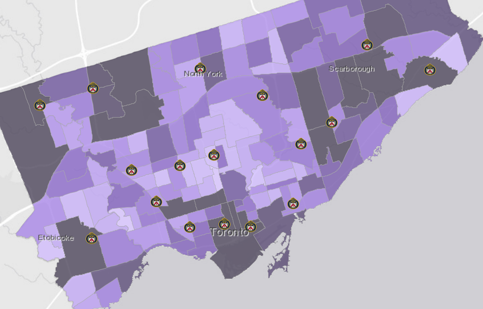
To see broader neighbourhood trends, when deciding where to rent or buy, for example, TPS’s Major Crime Indicators Map shows a “four-year average of occurrences from 2014 to 2017.” Lighter purple means a quieter area with less crime. Dark purple is a rough area. “Major crime indicators” include assault, auto theft, break and enter, homicide, robbery and theft over.
Fatal Traffic Collisions Map
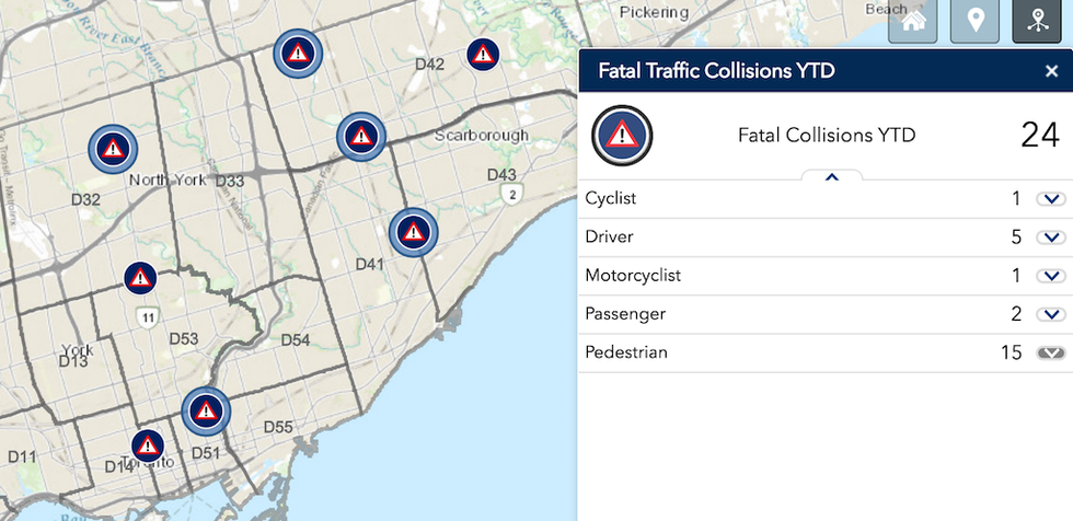
If the previous map wasn’t macabre enough, TPS’s Fatal Traffic Collisions map is a grim reminder that pedestrians are overwhelmingly the victims of fatal collisions in our city, more than all other kinds. This includes cyclists, drivers, motorcyclists, and passengers combined.
Pedestrian fatalities actually rival homicides.
If you discount the van attack, there were 19 homicides in Toronto as of late May — and 15 pedestrian deaths.
On that note, the City of Toronto has developed a Safety Measures Map. You can toggle through the options on the left to view various approaches the city is taking to improve road safety, such as red-light cameras, accessible pedestrian signals, warning signage and bikeways. The large green squares indicate road safety audits.
If you’re a bad driver, well, now you can see where all the red-light cameras are. But shame on you! Look at the previous map.
Route Comparison Map
Sidewalk Toronto recently created this Toronto Transit Explorer Map, which lets you compare routes via transit, cycling, walking, and bike-share in the city.
Time your trip by dropping the pin on your starting location and, as you mouse around, you’ll get an estimation — to the minute — of how long it will take you for each mode of transportation.
Old Toronto Map
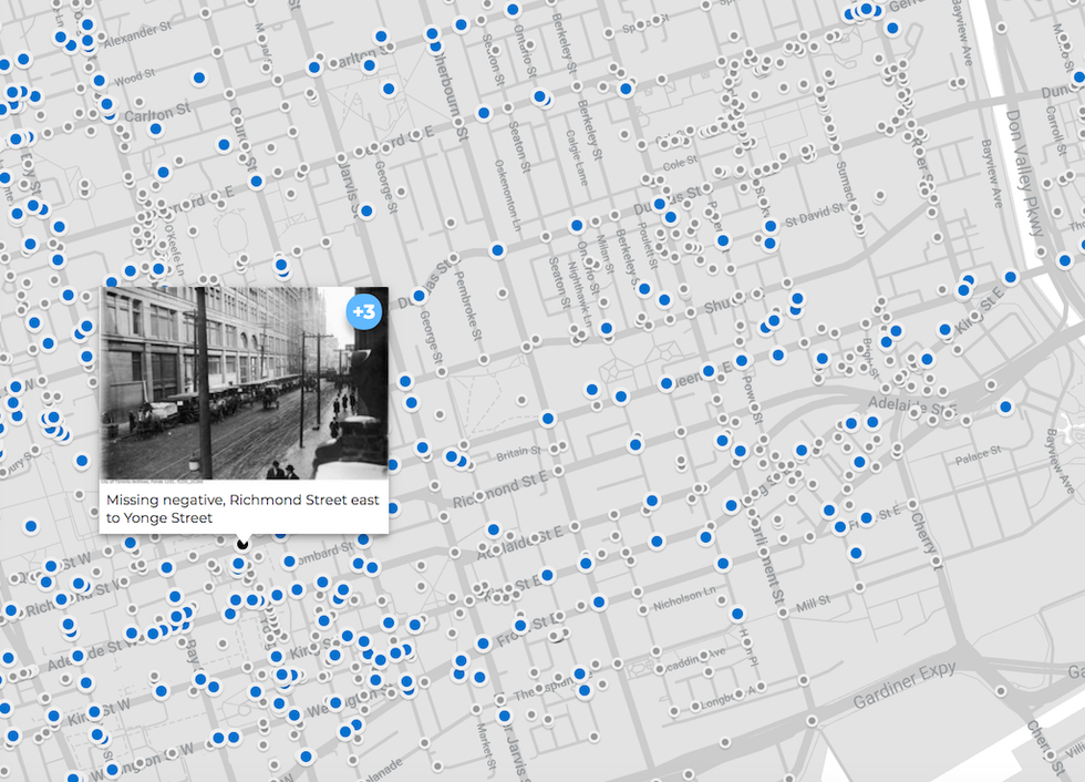
Want to see flapper-era, 1920s Toronto? Or an eerily condo-less skyline in the '70s? Check out Sidewalk Labs’ OldTO map right here. You can narrow the date range, and click through the blue dots for a fascinating trip through time.
OldTO “provides block-by-block browsing of historic Toronto photographs … [mapping] more than 30,000 (and growing!) historic city photographs from the City of Toronto Archives.”
Navigate to your neighbourhood — if you’re lucky, you can see how the locals lived before your time.
Development Map
After exploring Toronto’s past, Urban Toronto’s got a nifty development map that might help you envision the city’s future.
Perhaps you heard there was a condo proposal in your neighbourhood, or you see a demolition crew tearing down dilapidated buildings at a fenced-in site.
With this map, you can quickly tap into detailed project info: how many storeys, estimated occupancy date, retail square footage — and learn a bit about your newest neighbours.
For the idly curious, you can simply browse around the city and see what a hot market looks like in an evolving metropolis. And no, it wasn’t just your imagination — the Fashion District is truly insane right now.
Building Permit Map
Okay, so you’re a nosy neighbour.
Someone in the area has a team of contractors on their property and you’re curious about what they’re working on. Well, that information is actually public. And there’s a map for that.
This City of Toronto permit map lets you zoom around the city and simply click once, anywhere on the map, to see a pop-up of all the permits within a certain radius.
Many are classified “small residential projects.” If you click on them, you can see what they’re for: carports, main floor bathrooms, knocking down a wall in the kitchen, additions at the back. Even plumbing jobs are on there.
If anything, it’s a visualization of the city’s booming renovation industry, particularly when many homeowners are choosing to reno, rather than move.
Drop-In Recreation Programs Map
You’ve been looking at maps long enough and it’s time to get outside. Life is short, Toronto summers are even shorter, so carpe diem.
Some recreation and arts programs require registration, paperwork, upfront program fees and a time commitment over many weeks. But for the impulsive among us, drop-in programs are a blast.
This City of Toronto Drop-In Programs Map lets you find local activities on a whim: badminton, basketball, lane swim, fitness programs, African drumming, Tai Chi and … pickleball? Why not post something actually interesting to your Instagram this weekend.
Festival And Events Maps
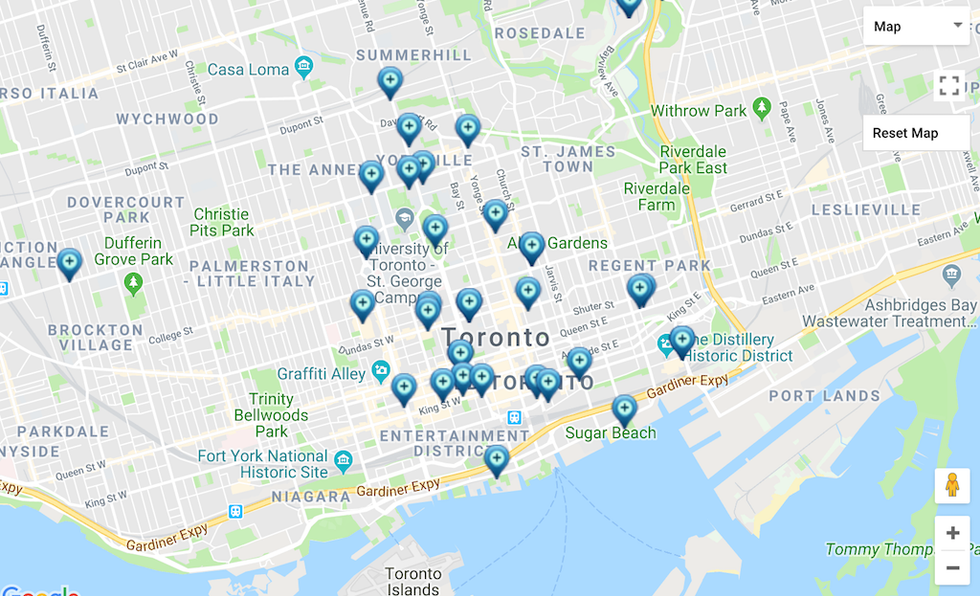
If you prefer artsy locales over community centres, we’ve got two maps for you.
Go to the Festivals & Events Calendar on the city’s website and click on “Map View.” Now you can browse gallery shows, historical exhibits, literary events, theatre, dance and more. For the budget conscious, you can narrow the search by selecting “free festivals and events” on the right.
A second History, Art & Culture map shows a smaller collection of arts programming at one of the 14 city-run museums, galleries and centres. Every single listing appears to be free. Many family-friendly options.
Toronto PATH Maps
True story: This writer was attempting to run a “quick errand” at work, got lost in the PATH, and surfaced 20 minutes later — very, very far away from the office.
Should’ve had a map for that.
Although it’s not interactive, these two PDF options are still handy for a rainy day, when you’re trying to navigate the core without an umbrella. Or if you’re wearing nice pumps and it just snowed outside. Or you’re in a wool suit and it’s a 30-degree July afternoon.
Get from point A to B, cool and dry, no matter what Toronto weather throws at you. Great for errands and snacks.
Construction Map
Want to see Toronto as a Mondrian-Pollock mashup?
Go to the Toronto Construction Map and, on the Feature Filter, click “Select all” and “Apply.”
Watch as the cityscape populates with all construction projects from Transportation Services, TTC, Toronto Water, City Planning, Economic Development and Culture, Parks, Forestry and Recreation, Utility Construction and others.
It’s absolutely maddening to look at. Click on the dots or lines to see details about each project.
Cycling Network Map
If you just got a new job in the city and you’re weighing transit options, check out this funky web of colourful lines. It’s the Cycling Network Map. You can plan a safe trip to work, weekend excursions, and contingency plans for the winter.
They’ve got an app for it too.
OK, we’ve had our map fun. Here’s a small selection of others that didn’t make the cut. And as always, tell us what we missed!
Checking live traffic — During rush hour, watch the whole city turn red.
TTC Live Map — When you’re catching a bus or streetcar.
Weather Radar Map — For weather nerds.
Dog Parks Map — When you adopt your new best friend.
A BIG list of City of Toronto maps — Yep, more maps. Many, MANY more maps.
