Humans are geared towards pleasure. And the quicker, the better — instant gratification can be found in your favourite apps, puppy GIFs and the liberal application of chocolate sauce.
So of course we all love Before & Afters. Within seconds, we cut through weeks or months of design and construction, from a dated, laminate kitchen to a polished temple of granite and steel. And we’ll enjoy any kind of B&A — attainable ones tempt us (“I could afford that”) and aspirational ones are fodder for our fantasies (“This is why we buy lottery tickets”).
And so Toronto Storeys has collected a variety of projects from Toronto designers — kitchens and bathrooms and dens, oh my! — to get those quick hits of old/new, tired/fresh, and rundown/rejuvenated.
CREATING HOME — NANCY KURTZ
Riverdale kitchen
This family in Riverdale, just south of the Danforth, gave their kitchen a well thought-out list of must-haves and nice-to-haves, such as banquette seating, a quartz countertop, small broom closet, pantry cabinet, appliance garage with a pull-out for their stand mixer, a baking storage section, lots of counter top space and ample lighting.
I was hired to design their kitchen and pick a flooring and wall colour that would flow throughout the main floor, says Toronto interior designer Nancy Kurtz.
They wanted to keep it traditional to be cohesive with the period of the house, but wanted to freshen it up with some modern touches. The finished kitchen is classic, bright and airy with a hint of history.
We went with an engineered hardwood throughout the main floor and a warm yellow to flow from one room to the next, making it a warm and cheerful place to be.
In looking for a table for the banquette, they decided to keep the existing one that the homeowner had made with the help of a friend some 20 years ago and their children had grown up with. It was too big for the new space, so we had it resized, redesigned and painted to suit the banquette.
LUX DESIGN ISABELLE BOBA
Downtown condo living area
LUX Design was given the task to create a functional, modern and clean space for their clients at their downtown Toronto condo, who wanted the area to be welcoming and inviting and to work cohesively with the industrial features of the suite.
We drew inspiration from the views directly outside the suite, says designer Isabelle Boba. One exterior wall consists of floor-to-ceiling windows, so we wanted to keep the furnishings light and open as possible.
You may notice that all the furniture pieces have legs, nothing rests directly on the floor. This helps open the space and creates a sense of airiness throughout the room.
The challenge with this project was working in tandem with the suites industrial features such as the concrete ceiling. Our clients concern was that the design could look too industrial if the furnishings were ultra modern. The overall style achieved works perfectly with the existing modern features of the residence.
Midtown condo, multi-functional den
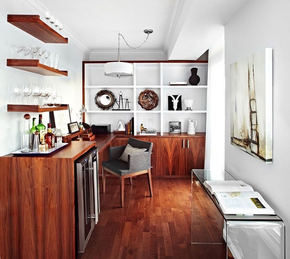
Our client came to LUX Design to help solve a space dilemma in their condo suite that would allow the room to be multi-functional, while flowing seamlessly into the living areas of the home. The den was cluttered and full of furnishings that were simply too dark and large for the space.
LUX Design worked out a design plan that would provide the client with functional and striking built-in cabinetry, capable of storing all necessities, while keeping the items out of sight. Working with a different woodgrain, we chose to keep the custom cabinetry to the same colouring of the floor to create a flow from the living areas to the den space.
An interesting feature of the space is the mini-bar area that almost separates the workspace from the rest of suite. The bar area works cohesively with the dining space and allows the workspace to become functional on its own, without taking anything away from the rest of the space.
The challenge with this particular project was the size of the den itself. Getting everything that the client wants into a small space forces the designer to think outside the box and create areas that are multifunctional, while adding an element of style and innovative design into the space.
NIKKA DESIGN BARBARA NYKE
1940s bungalow bathroom
With a full renovation, Nikka Design revamped a cramped and gloomy bathroom into what the client wanted: an inspired eco-boutique-style space, with a custom-designed, larger sustainable vanity that was height-adjusted to suit ergonomic needs.
The ambiance is modern, inviting, spa-like, comfortable and maximized for optimal space, says interior decorator Barbara Nyke. She says the bathtub is less narrow and the toilet a bit less deep to provide more floor space.
We designed this bathroom with sustainability as the driving factor. All of the items we selected have one or more sustainably designed features.
The flooring and countertop used the same travertine slab that was left over from another contractors projects. The colour, warmth and size happened to be perfectly suitable.
Other sustainable items include recessed lights on a dimmer, which saves energy, energy-efficient water flow, a honeycomb blind that keeps warmth in and cold out, a shower curtain and liners that are polyester and friendly plastic, which can be washed instead of thrown away, and a vanity made from coconut shells, which qualifies for LEED credits
Click here to see a video of the bathroom renovation.
Living room in Beach heritage home
This young family wanted to have a pretty and relaxing main room, with some industrial accents to work with the existing fireplace shaft.
We were tasked with designing an inviting, modern, luxurious, glamorous space. But how to accommodate the clients existing sideboard, TV and ginormous fireplace into a cohesive deliberate palette?, says Nyke.
We started with the foundational area rug. The clients thought that the 10 x 14 area rug would be too large for the space, but it turned out to be the perfect size providing a foundation for all of the other pieces to be contained on it.
A special feature in this room is the custom-designed artwork that conceals a large, wall-mounted TV. I wanted to include a personal item from the couple. They provided me with a photo of a significant destination they travelled to together, the Taj Mahal. I didnt want to have this iconic image displayed as a photograph. Rather I wanted to downplay it somehow and I decided to create an abstract image of it. Working together with a graphic designer we arrived at the final product that is slightly blurry, turning it into a piece of pop art.
We sourced a magnificent 52-high brass cone from India that is a striking contrast next to the steel-faced fireplace and is a geographical and cultural complement to the custom artwork.
GILLIAN GILLIES INTERIORS, INC. GILLIAN GILLIES
Lakeshore full condo redesign
These clients had happily lived in the condo for 14 years and decided to invest in their home after looking around, thinking they might move to a newer building to avoid a renovation. They couldnt find a match to the location, view and size of unit they had so they opted to renovate from top to bottom. The renovation was several months in the making.
The kitchen was totally redesigned, says interior designer Gillian Gillies. It previously had a dropped ceiling with fluorescent lighting. We were able to visually increase the size of the room by taking the ceiling back up to its original height. By installing fully integrated appliances with panel doors, the space looks larger and its more functional.
Taking the upper cabinets to the ceiling increases the storage space and we connected the kitchen and dining room millwork together, to add even more storage. The mix of dove gray and warm white cabinets adds a European flair to the space and these are paired with a geometric marble backsplash and a high gloss white quartz countertop.
Replacing the broadloom flooring with hardwood and connecting the colours in the dining room to the kitchen makes for a more even flow in the space. The custom millwork conceals the bulkhead that runs across the back of the dining room and extending the millwork wall to wall visually widens the wall.
We designed a pair of custom His & Hers sectional sofas to provide a perfect spot for TV viewing and lake viewing. The colour palette is very restful, with accents of the bolder colour in the client-owned artwork and toss pillows.
The master ensuite was badly outdated and very dark. By orientating the tub and shower across the back wall of the bathroom, we were able to lengthen the size of the vanity and add mirror to three walls. The mirror visually increases the size of the room and by surface-mounting the wall sconces on top of the mirror, it adds even more reflection and light. We added a linen closet with space for laundry baskets.
L|DESIGNS INTERIORS INC. LENORE RAPOSO
Etobicoke two-storey basement reno
L|Designs Interiors Inc. was hired to turn a dark, seldom-used basement into a space the family could retreat to for games and entertainment.
A couple of key elements were addressed to make the space come alive, says designer Lenore Raposo. An existing gas fireplace was raised off the floor to allow the warmth and beauty to be seen while playing billiards, and a cinder block wall was removed at the rooms entrance to allow an open and inviting walkway.
Custom built-in cabinets and live-edge wood tops were introduced to provide the needed storage and style, while the fireplace was treated to a gorgeous stone surround that went from floor to ceiling. Pot lights and sconces added the much-needed light with full-length drapes, a sectional and area rug completing the design.
The room now flows with the rest of the home and has become a go-to spot for the entire family.
