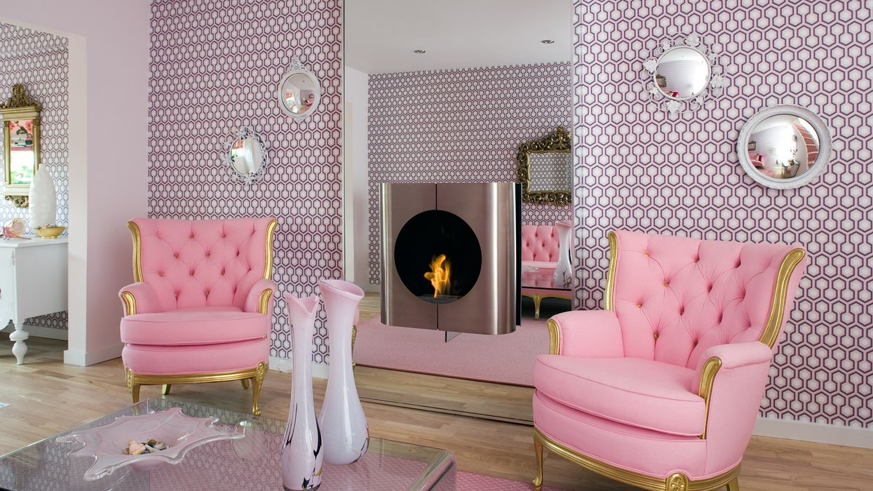
Marshmallow. Blush. Rose. Whichever moniker you choose, the zest for all things pink — or “Millennial Pink,” as the cool kids would have it — has been the undisputed design trend of 2017, a veritable tour de force across the decorating, haute couture and gastronomic landscapes.
Somewhat bizarrely, perhaps, pink has become androgynous. It thwarts (hoorah) the previous "rules" of the erstwhile tone for girls and masculine blue for boys. But from whence did the fervour for the delicate shade arise? Hmm …
Identifying a precise timeline is tricky, but one thing’s certain: its ascent wasn’t — initially — vertiginous. Via osmosis, in fact, 2017’s oh-so-cool pink ticket brewed — slowly and surely — long before imprinting itself, loudly and proudly, upon the decorative mainstay.
In 2016, Pantone decreed Rose Quartz its “Colour of the Year”, albeit hedging its bets, somewhat, by pairing the crystal ingénue with Serenity, a blue partner, envisioned, as we saw it, to jettison a spot of male/female balance into the mix. Poor Serenity, needless to say, struggled to even hold up the rear as the world decreed blush its new BFF. Whodathunkit? Pink for a girl AND for a boy.
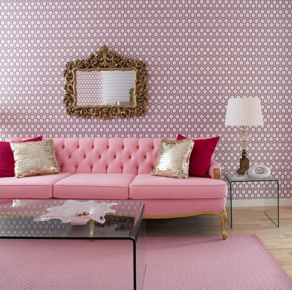
Hey, it might be but a humble paint colour, but its positioning — and the gender non-specific appeal it enjoys — nods to societal progress and equality.
As 2017 unwrapped, the clever folks at Pantone (actually, make that the sometimes clever folks at Pantone: 2015’s Colour of the Year, after all, the vomitus gravy toned Marsala, was also of their brewing) jumped on their own bandwagon, decreeing Pale Dogwood (another blush tinge) a preferred shade for Spring 2017. Perhaps, observing the accelerating appeal of Rose Quartz, they simply couldn’t bear to lose the pinky momentum they'd indeed helped birth. But let’s not give The P Mob all the glory - the drive for pink charts way back.
In the 1920s, for example, blush was wildly popular. The Art Deco period embraced it with gusto, in response to the eminently gloomier turn-of-the-century palette. By the 1940s, however, pink was sidelined. In the ’50s — and early ’60s — pink reared its jolly head once again, before resting until the ’80s, when it emerged, full-throttle, at the behest of Floridian decorators, hell-bent on Pepto Bismol schematics. Actually, make that Pepto Abysmal, for those grand decorating dames just couldn’t help adding ‘un petit piquant’ to the mix.Pink in the 1980s, you see, was a trickier contender than its eminently gentler Millennial sibling: with a hidden blue undercurrent, the 1980s iteration jarred with many other colours. This delivered a potentially awkward mismatched mood wherever it landed. Can we just say Golden Girls?
And then, as quickly as the 1980s pink hued phoenix had arisen, it collapsed, once again, into the depths of decorative oblivion where it remained, significantly overlooked by stylists and magazine editors, for the best part of two decades. But of course courtesy ofrest, fortification occurs. Everything, after all,iscyclical, right?
A distinct pivot that enabled pinks rebranding was WesAndersons cinematic epicThe Grand Budapest Hotel. Bursting onto the silver screen in 2014, it encapsulated a new era, visually speaking, for the 'one-minute-up, one-minute-down'colour. Centred, as the movie is, around a decadent, mystical hostelry, the pinkpalette, courtesy of the pinkpalace, jettisoned to the forefront of the worlds affection.
In 2015, when iPhone dropped its rose gold communicator, the Millennial fraternity became suddenly engaged, the devices metallic pastel-hued case serving asfurther illustration all things pink werewonderfullyde rigueur. Or wonderfully on fleek, to accord a spot of millennial parlance to this column.
And then, of course, Scandi fever latched its feverishly hip grip on creatives the world over. Cue lashings of white painted rooms with pale wood detail, black framed fenestration, twinkling gold finishes and soft pink accessories. Whether dreamy, velvet sofas in multifarious shades of mallow, goose-filled "ballet slipper" cushions or ceramics with cotton candy pallor, the P- word was suddenly huge business.
As 2017 blossomed, designersMarkJacobs, Balenciaga and Celine powdered their collections with Millennial Pink to excited acclaim. And ofcoursetheotherCeline, Ms. Dion, deployedtherosy tone as her weapon of choice to solidify her rebranding as, erm, fashionista. Indeed whilst out and about in Paris, on one occasion, the chanteuse was papped sporting a particularly"brave"pink ensemble. In that moment, we like to think she paused at a roadside caf to sip on a pink Aperol Spritz, 2017s undeniableboissondechoix. Or perhaps to tip a lilFrose(think adult slushy made with strawberry syrup and semi-frozen rose wine) down her swan-like neck.
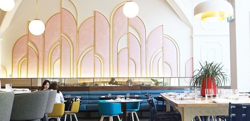
Damn it, we may well have sunk a few of each libation at various Summer of 17 soires, in pink-hued restaurants such as Oretta (opened, in association with uber-chef David Rocco) or Can Can on Harbord, designed by our old buddy (and undisputed Queen of Pink) Tiffany Pratt.
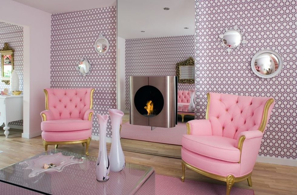
And, of course, weve plundered the pink palette, decoratively speaking, since the year dot. Not least in Canada, where our Millennial Pink kitchen and living room project caused quite the stir when launched, not in 2017, but a decade before. We like to consider it "au courant before its time" a blissful contradiction in terms. However appraised, its fair to report our forward-thinking concoction boasted growl sufficient to awaken the most style-deprived panther. Pink or otherwise.
And so, as 2017 draws towards its conclusion, wed wager there remains enough momentum to propel Millennial Pink to an even bigger audience next year. And possibly beyond. As rockgoddessPink asked in her epic 2017 comeback smash: What about us? Well, well certainly be specifying the upliftingcolour, as long as there remains appetite for the sweet, sweet decorative tone.
